Moving Politics Online: How Australian Mainstream Media Portray Social Media as Political Tools

(by Theresa Sauter and Axel Bruns)

Difficult as it may be to believe, we’re still almost three months out from the likely date of the next Australian federal election; campaigning during this time will become even more frenzied than it has been to date. A sea of speculation, controversy, and crisis surrounds the polls, and an increasing subset of the political battle is being fought online, through party Websites and social media. This is beginning to affect the balance of power in the overall media ecology: while mainstream media have historically played an important role in political campaigning and in shaping public opinions, online and social media now contribute new communicative ingredients to the public sphere.

While much attention has already been paid to the way that social media users critique and criticise the mainstream media, the opposite is less true. Conventional print and broadcast media have been instrumental in raising awareness about the political uses of social media platforms, and in doing so reflect contemporary views; so, what is the portrayal of social media in the media?

This question lies at the core of Social Media in the Media, a new report released by the ARC Centre of Excellence for Creative Industries and Innovation (CCI) in collaboration with the University of Oslo. In the report, we investigate how the political uses of social media are portrayed in the Australian mainstream media, in order to understand the perceptions that help shape how politicians, citizens and journalists employ new media tools to support their political objectives. Through a longitudinal comparative analysis we identify significant changes in how social media have been reported on since 2008. Overall, we are able to trace the gradual adoption and acceptance of social media as political tools, by politicians themselves as well as by journalists and everyday citizens.

Users

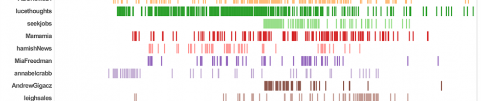
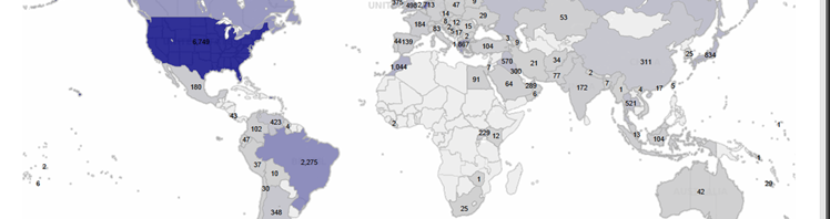
For the study, we sampled Australian mainstream media articles about social media in politics from the years 2008, 2010, and 2012. Over this time, politicians’ uses of social media were covered most prominently in the mainstream media; citizen uses came a close second overall. Journalists’ uses of social media in political reporting were considered far less often, even in spite of the considerable changes to journalistic practice that have occurred with the advent of real-time social media such as Twitter.

image

Politicians

Commentary on politicians’ uses of social media changed considerably from 2008 to 2012. Early articles commonly reported on politicians’ “incorrect” or “inefficient” use of social media, and suggested that they were mainly using these tools in order to demonstrate their ability to move with the times. But by 2010, and certainly by 2012, social media use was described as more integrated into the day-to-day practices of politicians. Social media had become normalised: they were no longer new. Similarly, articles that discussed the attitudes of politicians towards social media portrayed more negative attitudes in 2008 (viewing social media are “useless”, or even as detrimental to political debate). Considerably more positive perceptions emerged in 2010 and 2012. This suggests that politicians (and the journalists covering them) were beginning to see the benefits in using social media as political tools.

Citizens

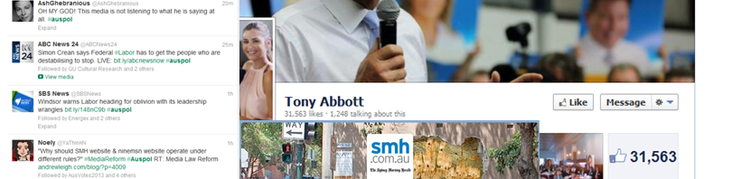
Members of the public were predominantly portrayed as using social media to campaign, fight for their rights, and support particular causes. News articles construct social media use by citizens as a means of demanding and achieving change and improvement in the public policy issues that affect them. Articles also suggested that citizens use social media to an important extent to support, criticise or gossip about politicians. Interestingly, such uses increased substantially in 2012; this may reflect a broader change in Australian political discourse (towards more emotive and inflammatory language, and strong public responses to it), with prominent pro- and anti-Gillard/Abbott groups emerging on social media platforms. It remains to be seen whether this remains an isolated episode, or whether it indicates a lasting shift in the reported political uses of social media.

Journalists

By contrast, the use of social media by journalists was much less reported on than uses by politicians and members of the public. We noted an overall increase in articles covering the use of social media by journalists; we also identified a shift across the years in how social media are portrayed as tools for political journalism: in 2008, articles demonstrated the potential of social media as tools for political news reporting, yet indicated that this potential was not being realised. By 2010, articles suggested that journalists had begun to use social media, if not yet in the most effective ways. Articles from 2012, finally, conveyed more successful engagement by journalists with social media; journalists also increasingly used social media as sources or supporting evidence in their reporting, for example by citing politicians’ social media statements and conversations. On average, some 26 percent of the articles we examined across 2008, 2010 and 2012 cited politicians’ statements on Twitter, Facebook or other social media platforms.

Social and Traditional Media: Connections, Comparisons, Contrasts

New, social media have traditionally been perceived as a threat to the established news industry; in Australia, this manifested especially in the ‘blog wars’ of the mid to late 2000s. However, our study reveals a significant decrease in the number of articles that focus on a comparison of social and traditional media from 2008 to 2012. Instead, journalistic coverage of social media in politics has shifted to a portrayal of social and traditional media as sitting comfortably alongside one another. By 2008, a perception of social media as useful additional media had already become dominant, in fact; in subsequent years, coverage focussed increasingly on the growing integration of social media into political practice, engagement, and reporting. Combined with the overall decrease in articles that compared social and traditional media, this shows that social media in politics have become normalised – the debate is no longer over whether, but how they may be used.

image

The role of the media in setting political agendas and impacting on public opinion has long been noted. As social media become increasingly integrated into the modern political landscape, then, we need to consider the contribution they make to setting political agendas. Analysing their portrayal as political tools by traditional media can provide important insights into the emergence of what Yochai Benkler has termed ‘hybrid media ecologies’. In light of the coming federal election we plan to continue our examination of how social media are conceptualised and used by politicians, citizens and journalists, comparing especially the election years 2010 and 2013.

Already, our study shows a political media ecology in considerable flux, and points to significant changes to the professional practices of politicians, journalists, and other stakeholders in the political process in Australia. As politicians, citizens and journalists come to terms with using social media, we need to turn our focus to the impact of these tools, and to develop new methods for analysing and understanding them.

This report is part of a joint research project on The Impact of Social Media on Agenda-Setting in Election Campaigns with scholars from the University of Oslo, the University of Bergen, Uppsala University, and California State University. It investigates the interaction and inter-media agenda-setting between social media and mainstream media in different cultural and political settings, in order to develop cross-national comparisons. (Cover image by whatleydude on Flickr.)

#spill: How Twitter Reacted to the Labor Leadership Challenge

It’s that time of the electoral cycle again where the Australian Labor Party changes leaders in response to its flagging opinion polling. As with the 2010 leadership spill, which we touched on here, there was a great deal of activity on Twitter last night: the #spill hashtag, in particular, served as one forum through which rumours, information, commentary, and snark were shared in some quantity. Here’s a (very) quick analysis of how the spill played out on Twitter last night.

First,  there is a pronounced rise in #spill activity from around 16:15 onwards, as Prime Minister Julia Gillard announces the leadership ballot in a live interview with Sky News; this builds gradually into an 1,100-tweets-per-minute frenzy just before 20:00 as the results of the vote are announced. Other spikes in activity occur around 18:40, as factional leader Bill Shorten announces that he is switching his support to Kevin Rudd; at 21:20, as Julia Gillard makes her farewell speech as Prime Minister; and 22:50, as PM-elect Kevin Rudd and deputy Anthony Albanese hold their own press conference. Opposition Leader Tony Abbott’s response to the events of the day, in a presser from 23:05, doesn’t quite register as much any more – and he is probably not helped by the fact that only a handful of television networks covered it live.

image

The graph above also shows the distinction between various types of tweets: here, original tweets (i.e. tweets which are neither retweets not @replies) are fairly evenly matched with retweets; the latter dominate especially in the later stages of the event, as the volume of participation in #spill, but also amount of actual, confirmed information worth sharing increases.

Genuine @replies (as distinct from retweets) constitute only a small percentage of the total #spill volume, most likely not because Twitter users weren’t replying to one another, but because those replies only rarely carried the #spill hashtag and therefore do not form part of our dataset. Generally, there will be a great deal of follow-on conversation, and of non-hashtagged discussions, in addition to what we are able to analyse here – the #spill dataset itself forms only the tip of the iceberg of last night’s Twitter activity.

Overall, more than 31,000 unique Twitter users posted or retweeted #spill messages last night. If we divide that userbase following the well-known 1/9/90 rule (ordering them by the volume of tweets they contributed, and distinguishing them into a top 1% of lead users; the next 9% of highly active users; and the remaining 90% of least active users), we find a few notable differences between these groups. It’s the handful of lead users who contributed disproportionately many original tweets, while the less active users participated more frequently by retweeting other users’ tweets. However, the lead users did not dominate the #spill hashtag – the top users punched above their weight by contributing some 13% of all tweets (so they were lead users), but others participated strongly as well.

image

Much of the retweeting and @replying activity within the #spill hashtag centred around a handful of keyparticipants. These include some of the politicians involved – chiefly the Prime Minister and her challenger – as well as the news organisations and journalists covering the event. The following graph provides some insight into the distribution of Twitter users’ attention, and shows whether these accounts were predominantly referenced in retweets or genuine @replies:

image

Unsurprisingly, Gillard and Rudd are mentioned rather than retweeted; neither of them found the time during the leadership spill to do any tweeting of their own. Beyond this, the public broadcaster figures strongly, and mainly as a source of information: #spill tweets by both @abcnews and @ABCNews24 are widely shared by other users. The smaller component of @replies to these accounts mainly comment on the quality of the ABC’s coverage (including some occasional vision switching issues at ABC News 24, and a rather presumptive graphic behind 7.30 host Leigh Sales just as she said the ABC would wait for official confirmation of the ballot result rather than share rumours). Most of the @mentions of the @leighsales account also relate to this graphic, or comment on her overall performance as host; for obvious reasons, she did not tweet during the broadcast.

Other prominent users are present mainly because one or two of their tweets managed to capture the spur of the moment and were widely retweeted. These include

RT @lucethoughts: Somewhere, Tony Abbott is sitting in a darkened room, slowly stroking a Persian cat. #spill

– which, remarkably, was the only #spill tweet from that account, but was still widely retweeted even during the following morning – as well as a somewhat clumsy attempt by job site Seek to cash in on the #spill story:

Hey @JuliaGillard, we can help you out! ; ) #spill #auspol

(a great number of retweets here as well, but also quite a few critical comments about the lack of respect shown for the outgoing Prime Minister).

Here’s how these mentions distribute across the overall #spill timeframe:

Key User Mentions

This illustrates quite clearly the long-term impact of the @lucethoughts tweet as well as the much shorter-lived reaction to @seekjobs. And more broadly, of course, we’re seeing the focus of the #spill community shift between mentions of @JuliaGillard and @KRuddMP, as well as the changing attention to (and/or resonance of) the different news organisations.

Finally, for what it’s worth, a quick indication of the global attention paid to this event. This is based only on those #spill tweets which contained their sender’s GPS details – accounting for little more than 1% of all #spill tweets. So, the map below is indicative of interest only, and each dot on this map may represent many more Twitter users in those places who chose not to reveal their current location.

tweet-map

ATNIX: Australian Twitter News Index, Weeks 12-19/2013

Oh dear – I’m afraid it’s been some time since I last updated our Australian Twitter News Index; I’ve been significantly delayed by a number of overseas research engagements. So, to catch up to somewhere approximating the present, here’s a condensed run through some of the major developments of the past couple of months, starting from where we left off in the middle of March and taking us through the middle of May. I’ll update the last fortnight in some more detail in a separate post.

Standard background information: this analysis is based on tracking all tweets which contain links pointing to the URLs of a large selection of leading Australian news and opinion sites (even if those links have been shortened at some point). Datasets for those sites which cover more than just news and opinion (abc.net.au, sbs.com.au, ninemsn.com.au) are filtered to exclude irrelevant sections of those sites (e.g. abc.net.au/tv, catchup.ninemsn.com.au). For our analysis of ‘opinion’ link sharing, we include only those sub-sections of mainstream sites which contain opinion and commentary (e.g. abc.net.au/unleashed, articles on theaustralian.com.au which include ‘/opinion’ in the URL), and compare them with dedicated opinion and commentary sites.

See the posts tagged ‘ATNIX’ on this site for a full collection of previous results.

ATNIX Weeks 12-19/2013: 18 Mar. to 12 May 2013

We begin with the weekly figures for the sharing of links to Australian news sites on Twitter. Except for a brief dip in week 13 (158,000 tweets), the overall volume of tweets sharing news has been strong over this eight-week period – other than during that week, we never saw fewer than 170,000 tweets per week, and weeks 16 (195,000) and 18 (205,000) even troubled the 200,000-tweet marker.

image

The most remarkable story over these weeks is the continued strong performance of the ABC’s news content compared to long-time front runner Sydney Morning Herald. Notably, this isn’t due to a slump in the SMH’s own numbers, which – at an average of just under 30,000 tweets per week – remain slightly above the long-term average for the site. Rather, for reasons which I’m at a loss to explain, ABC News has pulled ahead by some margin since week 5 or so, and has put daylight between itself and its nearest rival. To illustrate: during the second half of 2012, the ABC received an average of 26,000 tweets per week for its news content – since week 6 of this year, that average has risen to 36,000. And this has happened while the links received by other sites have remained comparatively static.

Now, it’s possible that this increase in tweets linking to the ABC is the result of a net of spambots – Twitter accounts which seek to make their message appear less ‘spammy’ by including legitimate URLs in their tweets. News sites are often used for this purpose, since their content is easily discoverable and changes frequently. But – as you may remember from when news.com.au received an unexpected boost from spammers – those bots are often fairly easy to detect; they’re extremely heavy posters, use non-standard URL shorteners, or show other unusual tweeting patterns. None of this appears to be the case here – so either we’re dealing with a new step up in spamming technology, or a genuine and sustained increase in the number of links to ABC News content that are being shared on Twitter.

For the opinion and commentary sites and sections, the picture looks remarkably different – and at just under 25,000 tweets per week, the overall average has been bang on target for the year to date, but also (as we’ve become used to by now) subject to much more substantial day-to-day and week-to-week fluctuations than is the case for the sharing of news links.

image

There’s an obvious hitch, though, and that’s with the figures for The Conversation. Unknown to me, unfortunately The Conversation changed its default settings a few weeks back, as part of its expansion beyond Australia: while theconversation.edu.au still works, it now redirects immediately to theconversation.com, and almost all articles being shared on Twitter (especially through URL shorteners) also default to that URL. I wasn’t aware of this change, and thoroughly disagree with it: .com domain names are almost literally a dime-a-dozen commodity these days; .edu.au domains are far more tightly regulated and available only to a select group of accredited Australian education and research providers and related entities. The Conversation’s .edu.au domain always set it apart from the other opinion-mongers in Australia, as a site supported and populated by Australian universities and their staff. It would be a shame if this important distinction was lost in the shift to theconversation.com.

Most immediately, what the change has meant is that The Conversation has temporarily dropped off our radar, since week 13: we’ve dutifully continued to track theconversation.edu.au, but the real activity had shifted to theconversation.com. We’ll rectify this in the coming weeks, but for now it’s worth noting that the added 4,000-odd tweets which The Conversation regularly draws would have pushed our weekly opinion averages quite a bit higher than they’ve turned out to be.

The daily patterns over the past few weeks also point to the exceptional performance of ABC News links during this time; on its best days, the ABC received well over 4,000 more tweets than its nearest competitor, the Sydney Morning Herald. At the same time, though, the ABC’s characteristically deep slump during the weekend continues – in the absence of the weekend edition content which newspaper sites like SMH and Age excel at, the ABC drops down much further than its competitors during Saturday and Sunday. This also lends support to the theory that its strong weekday performance isn’t due to spam accounts: spambots don’t take time off on weekends, do they?

image

While there isn’t the time and space here to examine all of the various spikes in news sharing activity over the past eight weeks in full detail, and handful do stand out and deserve further scrutiny. ABC News’ most remarkable spike occurs on 16 April, when it even touches the 10,000 tweets/day mark. The reasons for this are diverse, however: articles covering the Boston Marathon attacks and the simultaneous fire at the JFK Library receive some 600 and 320 tweets, respectively, and a range of subsequent updates are also shared. At nearly 900 tweets, the leading article on the day, however, refers to a new bombing in Iraq which killed 20 – an event whose coverage many Twitter users compared to the wall-to-wall reporting about the Boston attack and subsequent manhunt. Third in the mix, with some 720 tweets, is a domestic story about One Nation co-founder David Ettridge’s new lawsuit against Opposition Leader Tony Abbott.

The second most significant ABC spike during these weeks is on 7 May, and here it appears that the ABC may have tapped into substantial overseas interest as well as a domestic audience: the lead item this day is an extended interview with Malaysian Opposition Leader Anwar Ibrahim which was published under the Australia Network News banner and drew some 630 tweets. Given this billing, and Twitter’s popularity in Malaysia, it’s likely that quite a few of the users sharing the story would have been based in Malaysia.

Finally, also of note is a very strong spike for The Age on 29 April. Here, we once again see the utility of Twitter as a medium for breaking news and urgent messages being demonstrated: some 3,300 tweets that day referred to just one story, about a 15-year-old girl who had disappeared in Melbourne the afternoon before. Notably, some 2,700 of those tweets linked to a version of the article which was formatted for mobile devices; clearly, many Melbournians decided to help raise awareness of the police call for assistance as soon as they saw it.

So much, then, for a quick catch-up which almost brings us up to speed again. Next time we’ll deal with some of the issues caused by recent changes to how Twitter provides is data, reintroduce The Conversation to ATNIX, and check on how the Australian edition of UK newspaper The Guardian has been received.

A First Look at Twitter Ratios: Rise of the Lurkers?

For this blog, I have used data sets which include the first million and recent million IDs discussed in recent posts, in addition to new data from our CCI Data Scientist Troy Sadkowsky covering ID’s between 1000000000-1,000,999,999 (1 million Ids) and 1,001,000,000-1,011,000,000 (10 million Ids). This data covers both the first few months of Twitter operation, as well as periods in early 2011, late 2012 and early 2013, as seen below:

DataPoints

Because these accounts are of different ages, for some comparisons it is useful to look at the ratios, that is the statuses, followers, favorites etc on a per-day basis. There is still a potential bias here towards newer accounts, in that they are perhaps likely to be more active having recently decided to join the platform, so that is something to be aware of in viewing the data that follows.  In this post I do not intend to speculate too much on what the data means (excepting one specific example, which we will come to), as much of it needs further work to refine, however hopefully this first look at the data we are obtaining is interesting nonetheless.

Statuses Per Day

For each of the charts below, what is shown are the statuses per day for all accounts generated on a particular day. the volume of account registrations (which we estimated at 1 million IDs per 8 hours in a recent post) means that for the more recent datasets the data only covers accounts created over the period of a few days. In Tableau, these ratios are generated by the formula: ([statuses_count]/((**creation date**-([created_at]/1000))/84000)), where the creation date is the unix time at which the data was collected. Given that, at the time, this process took some hours to run, there is an element of imprecision here, however in the grand scheme of things the impact should be minimal.

StatusPerDayvsDate

Followers Per Day

These visualisations show an increased numbers of followers per day in new accounts, however that is to be expected given that there is a finite number of twitter users, and newer accounts will show an increased velocity of followers.

FollowersPerDayvsDate

Followers Per Day (Less than 2000 – Excludes 13 accounts)

This is a slightly more interesting visualisation than the one above, as it excludes accounts including @BarackObama which heavily skewed the scale.  Highlighted here is that newer accounts often have a lower rate of followers/day than those a few months old. Also interesting is that a number of the early accounts maintain high followers/day ratio, which perhaps speaks largely to the identify of those early adopters, such as news organisations and Starbucks which was discussed in a previous post.

FollowersPerDayvsDate-2kcapexclude13

Friends Per Day

This data has a similar caveat to that given above, in that newer accounts are likely to follow more people in their early days than once the account has aged. Nonetheless, as with the followers chart above, the drop-off on the more recent accounts is interesting, which perhaps suggest that the following of large number of users is not an immediate process, but comes having established a presence on Twitter for a period of months.

FriendsPerDayvsDate

Friends vs. Followers

Having established that baseline data, I also mapped these ratios against each other. For example, here is Followers per Day vs. Friends Per Day, colour-coded for data-set (the darker the colour the newer the account, the exact breakdown can be seen on the colour key). I’ve again cut out extremities in both the followers and friends count to show the majority of the user base:

FriendsPerDayvsFollowersPerDay

Statuses vs. Favorites.

One of these charts stood out however, and sparked my interest for future work.  Anecdotally, several have commented on the recent increase of ‘favoriting’ on Twitter,  with some users appearing to adopt the feature as equivalent to the Facebook Like. The below chart, which shows Statuses Per Day graphed against Favorites per day shows an interesting pattern in the bottom left corner. In this chart, light blue is the ‘new data’ (11 million IDs from c. December ‘12), red are the ‘first million’ Ids, and brown are the ‘recent million’ (e.g. March ’13).

StatusperDayvsFavsPerDay2

As you can see, there appear to be a significant number of users who favorite as many as 30 tweets a day, but don’t post new content; thus mimicking the ‘lurker’ behaviour identified on other platforms.  Additionally, the data may show a rise in favoriting, in that while there are a chunk of early users who are averaging over 10 favorites/day (and we can’t tell for sure whether this is a lot of favoriting recently or a steady rate over the years), amongst more recent users we are seeing favorite counts of up to 70/day, suggesting this may be a more recent phenomenon.

And, as the first chart above shows, there’s a lot more data to collect and analyse!

A Month of Vines: An early look at Vine through Twitter

With my CCI colleague Jean Burgess, we have recently been tracking the development and use of Vine through our existing Twitter tools. More on accessing and tracking Vine will be forthcoming in future posts, but below we will discuss the first month of our Vine data, from 18 February to 18 March. It remains unclear exactly what proportion of total vines are being distributed through Twitter, however preliminary samples would indicate it may not be a majority. It’s also worth noting that in looking at Vines on Twitter, popularity and re-tweets are not necessarily a measure of the quality, or uniqueness, of the vine itself, but also the celebrity of the user; notable among the early sample are well established YouTube and Television personalities.

Overall Volume

dailyvines

This data represents tweets that contain Vine URL’s (i.e. match “vine.co”), and thus includes videos being posted to twitter, as well as replies and re-tweets that contain the URL. As you can see in the above diagram, tweets about vines have increased in volume significantly over the period (the final day represents incomplete data). From around 2000 vines per day on Twitter during the first few days of data collection, the final weekend (16/17 March) saw 6000-7000 tweets. There also appears to be weekly variation, in that weekends see more tweets posted than weekdays.

Daily Patterns

Screen Shot 2013-02-26 at 6.49.28 PM

Taking a look at the first week of vines provides some more detail about the daily pattern observed above. On each day there is a sharp drop-off to a floor happening between 16:00 and 20:00 AEST, which is 1am – 5am US Eastern Time. The daily peaks vary from 1am and 12noon AEST, which is 10am and 9pm US Eastern. This would certainly suggest that Vine is currently very US-centric.

Some Metrics

vinesbytype copy

Compared to other tweets we have investigated, tweets surrounding vines are fairly well distributed. Among over 1.5million tweets in this first months database, there were 441,091 individual users, so an average of just over 3 tweets per person. The top 1% by volume contains those with over 28 tweets, and is 195,280 of the total.

Across the whole user base, 74% of tweets are original (that is, are not either a retweet or a reply), 18.5% are retweets, and 7.5% replies. Among the 294,499 users who make up the lower 50% (between 1 and 3 tweets), the retweet percentage increases to 47.1% (with replies remaining similar at 8.8%), suggesting that these users are largely not part of the Vine community, but re-tweeting something from somebody they are following. The top 1% (4490 users), with more than 28 tweets, have 5.9% replies, and just 4.1% retweets, with over 90% of the tweets being original, suggesting that these users are the ones posting videos on a frequent basis. Those between 3 and 28 tweets similarly have 82% original tweets, so this grouping will capture those who have gone beyond simply a #firstpost with Vine.

Hashtags

popularhash

615,830 of the 1.5million tweets contained a hashtag; encouraged by the Vine app to select tags which apply to their videos. While we want to conduct further, detailed, work to look at the content of the videos, the hash tags do provide us with a way to take an early look. Hashtags, unlike in our usual Twitter analysis, are not used in Vine to organize a conversation about a topic (although some may serve this purpose, such as #newsvine), but to enable people to find videos containing specific content, and indeed tags and user profiles are the only way to find videos through the Vine App.

Whilst the Vine App suggests hashtags, users are free to add their own, and as such there were 128,770 hashtags in the data set. The chart above shows the top 20. Notable is that #firstpost is included 21,276 times – this is the default hashtag in the Vine tutorial for a users initial video. Vine is also a common term (and our tools differentiate between upper and lower case, and so combined this gives 14,389 occurrences. SXSW is also prominent (in both capitalized and uncapitalized forms), with 10920 occurrences, which is obvious period specific. The other common hashtags, #cat, #cute, #dog, #favthings, #food, #funny, #howto, #magic, #music, #pets, #travel, and #vineportraits, give us an interesting first glance into uses of Vine.

Applications

tweetsource copy

No surprises here… the vast majority of these tweets come directly from the Vine application. Again this is filtered; the top 10 are displayed with those without a source excluded. The Twitter iPhone app is in second place and Twitter.com third. These would presumably be retweets and replies.


Popular Tweets

populartweets

The above chart shows the 50 most popular re-tweets containing a vine URL during the past month. Those URL’s are reproduced below, so that you can check out the videos. The prominence of celebrities from other forms of media and marketing campaigns stands out amongst this selection.

text Count
RT @DarrenCriss: My glee warm up to start the day. And intro to Vine. http://t.co/WSQom4BEAo 1,789
RT @VEVO_UK: Demi signs the VEVO wall http://t.co/zi6MJE4u 1,471
RT @fucktyler: WHERE IS IT http://t.co/6igl2EJCJ9 1,230
RT @fucktyler: SANDWHICHHH http://t.co/kgD9zYwYkX 1,132
RT @DarrenCriss: Me getting into Blaine mode. Wish it actually took this long. http://t.co/FzxpEAw5TN 1,113
RT @fucktyler: http://t.co/7HJFNdXGdP 1,005
RT @fucktyler: BURFDAY http://t.co/37ej09RQyv 998
RT @fucktyler: FAG http://t.co/A27rTa2sfn 884
RT @CostaCoffee: Have fun with Costa! 🙂 #lovecosta http://t.co/PbFf5JXa 811
RT @fucktyler: http://t.co/aBBvlGz24t 753
RT @CostaCoffee: Sip like you mean it.. #lovecosta http://t.co/Ni6QuxvFRP 714
RT @CostaCoffee: Too many treats to choose from.. #lovecosta http://t.co/zKY2q05olf 696
RT @CostaCoffee: Made for loving you…. #lovecosta http://t.co/F8LG7EUJ 660
RT @fucktyler: Jasper http://t.co/jumrmjjlKp 640
RT @VEVO_UK: http://t.co/c5lKadbY 636
RT @fucktyler: PAUSE HAHA http://t.co/MAgSjzuPj6 619
RT @TeamMessi: …and here’s Leo signing them! Is this the worlds first #vine of Leo Messi? RT and follow to win. #askmessi https://t.co/TKYYsVUOoa 583
RT @markhoppus: Getting ready. http://t.co/5VlFbphB 544
RT @CostaCoffee: Hot chocolate‚ cream‚ marshmallows.. How do you have yours? #lovecosta http://t.co/RqdhyUbokw 507
RT @levvis_: me and harry styles and lily allen x http://t.co/2OBOEoPXXb 504
RT @markhoppus: Australia. http://t.co/KSFh0ZJI8k 493
RT @christoferdrew: photoshoot for sunflower http://t.co/tfI5kqt0Wy 485
RT @fucktyler: U FUCKED MY BITCH http://t.co/othkq6pCVB 473
RT @adidasUK: Follow @adidasUK & RT for the chance to win these signed boots by Gareth Bale! http://t.co/2EUtIhDV7v 457
RT @TeamMessi: …y aquí está Leo firmándolas! ¿Es este el primer #vine de Leo Messi? Haz RT y síguenos para ganarlas. #askmessi https://t.co/TKYYsVUOoa 450
RT @CostaCoffee: Made for loving you… #lovecosta http://t.co/F8LG7EUJ 448
RT @fucktyler: http://t.co/mHU19ePm7r 417
RT @GilletteUK: Gillette evolution. RT before 19/3 for your chance to WIN one of 5 ProGlide Silvertouch razors!! http://t.co/iFhSC2tvQK 413
RT @BrooklynNets: JOE JOHNSON DOES IT AGAIN! http://t.co/vsCLjWaU 403
RT @RouReynolds: nnnnnyehh http://t.co/GomLa8h5Ey 402
RT @Battlefield: Straight from the video editing suite: Prepare 4 Battle – 03.27! This sneak peek now‚ more soon. (Please RT!… http://t.co/CANw5vb9iW 398
RT @Lakers: That’s a W. #GoLakers http://t.co/mXhP7jZqyt 396
RT @louteasdale: Do something funny for money todaaaaay #comicrelief #halfbeard @benwinston http://t.co/8DFNd4zHkz 394
RT @aaronpaul_8: Every time I drink a coke this is how how feel during the act of drinking the coke. http://t.co/tqE08jmOTC 376
RT @Pysjamasgutten: Enkelte jenter ass http://t.co/rLVHUU6Jzf 351
RT @markhoppus: Happy Mother’s Day! http://t.co/c7FhBA8jWk 349
RT @fucktyler: 3 http://t.co/jC2M96qarZ 338
RT @coldplay: #MXcomic #issue1 A http://t.co/19DrcnOU9R 334
RT @fucktyler: Hahaha http://t.co/MnkTvtkx80 324
RT @markhoppus: Tour life. http://t.co/66tcJAWCG3 317
RT @ashleydzerigian: Love in the elevator! @keisharenee @rickjordandrums @adamlambert @whoisjohnnyrice @tommyjoeratliff @lovemysp… http://t.co/EZW8RvA1py 308
RT @MTVteenwolf: #83Days http://t.co/Dr8OUErBkj 303
RT @nikosofficiel: #mattpokora ou pas? @mpofficial http://t.co/4m9VTlfeoh 289
RT @rekorderlig: Follow and RT for the chance to win this Winter Cider set #beautifullyswedish http://t.co/lecrOKJezu 288
RT @JaredLeto: Del nuevo video de #MARS: Saludaste a Winston? https://t.co/GbedbZIO0i 267
RT @fucktyler: http://t.co/mc2OUYG8KC 262
RT @JaredLeto: RT @30SECONDSTOMARS #MARSisCOMING http://t.co/hcFy9Ktt 257
RT @GilletteUK: Gillette evolution. RT before 19/3 for your chance to WIN one of 5 ProGlide Silvertouch razors! http://t.co/iFhSC2tvQK 207


So that’s an early look at Vines; I expect to update once more on Vines before I head off on conference travels in early May, and a post on Twitter ratios will also be coming next week.

The First Million IDs on Twitter

Following on from Friday’s post, in which we looked at a number of recent accounts on Twitter, this post considers the first million Twitter IDs.

When did they join?

IDbyTime

As you can see from the above graph, which shows Account creation date along the horizontal and ID along the vertical, a spattering of accounts were registered from late March to July 2006, with the first at approximately 20:50 on 21 March, ID#12. It is worth mentioning here that these are only accounts that are still active, and so it is impossible to access data for those which are no longer active. A slight increase in the registration rate of users occurred between November and December 2006, while late December ‘06 to early January ‘07 saw a sharp increase, corresponding to US publicity, which tapered off to a steadier rate until March ‘07 at which point we see a second publicity driven spike which took the IDs over the 1 million range. It is worth noting that of these 1 million IDs, only 48,546 accounts remain active.

Where in the world (is Twitter user x)?

map

This map contains some of the limitations discussed on Friday; namely that it is created by time zone, although interestingly does not show the same bias toward alphabetically prominent time zones such as Amsterdam as is present with new users. Also interesting here is the prominence of Italy, with about 4% of the active accounts coming from Italy, far higher than any non-English speaking country, and higher than Australia. The US is dominant, with well over 50%, however the neighbour to the north, Canada, accounts for only 0.3%, again a sharp contrast to the newly created data. Other hotbeds of early Twitter activity (those with over 1,000 of the 40,000 accounts) are limited to Australia and the United Kingdom.

What have they been up to since 2006?

StatusbyID

The above chart shows total statuses posted, and shows some interesting patterns; whilst there are a few users with 400,000 plus tweets, the majority have managed to restrict themselves to 200,000 or less across the past 7 years, with the majority clustered below 50k. As we saw with the join times graph previously, there are a number of missing IDs (and thus 0 statuses) around the middle of the chart. The below chart, in which users are placed into ‘bins’ of 100,000 IDs again shows a fairly average status count among the users, suggesting that those early users whose account is still active (i.e. hasn’t been deleted) have tweeted more-or-less the same number of times as those joining during one of the publicity cycles.

StatusbyID-bin

Followers and Followees

followersbyID

Here, I have removed eight data points from the visualisation, which shows the numbers of followers by account ID; users with 29.3m (Barack Obama), 16.5m (Twitter themselves), 7.67million (New York Times), 7.5 million (CNN), 3.5 million (Starbucks), 3.2 million (BBC World), 3.17m (Mashable) and 2.6m (TechCrunch) followers. One random note from removing these is that Twitter themselves have an ID in the 783,000 range, while Starbucks are in the 31,000 range – clearly an early priority of the Twitter developers was not to create a corporate identity for themselves!

Again, we see a large number of IDs in the centre of the graph with little activity, replicating previous data, with two more populous clusters to either side. Here though, the later users show a marked increase in connectedness over those on the left side of the graph. The very early adopters (perhaps those who were in some way connected to a member of the development team), while tweeting regularly, may then be less connected than those tech aficionados who joined during the early phase of publicity.

followingbyID

The above diagram shows the number of accounts a user is following. Here, two accounts have been cut from this diagram for visualisation purposes; one following 665,279 users (Barack Obama) and the other 229,915. Otherwise, we see a fairly similar pattern as with statuses and followers, the missing IDs in the middle, with users to the left and right having fairly similar distributions to the followers graph above, re-enforcing the suggestion that later IDs seem to be more connected than the early users.

Overall then, an interesting distribution of early Twitter uses, which is in some ways similar and some ways different from the more recent users discussed on Friday. Now just to fill in the missing hundreds of million!

Who’s Joining Twitter? A look at 1 million recent IDs

Currently, at QUT Social Media HQ, we’re in the process of developing the new version of our Twitter capture software, led by CCI Data Scientist Troy Sadkowsky. During development, we’ve extracted a few interesting datasets, and this blog post is going to examine one of those; a set of one million Twitter IDs. This set was gathered by registering a new Twitter account on 19 March, and then capturing the user profiles of the 1 million Twitter IDs that immediately preceded that; the data being collected several days after the account creation. As it happened, these IDs had creation dates covering a range of 8 hours and, by the time we collected the data, 422,794 individual accounts. The discrepancy between the number of IDs and accounts requires further exploration; while a number of them could be closed accounts, it seems unlikely that Twitter closed almost 600,000 newly opened accounts within a few days. Thus, we are left to wonder if some IDs are never allocated, whether IDs are allocated at the start of the registration process and never activated, or whether something else entirely is going on. Regardless, the 422,794 accounts in 8 hours represents a rate of 833 new accounts per minute. There were some other interesting findings, so on we go..

Registration Engines?

twitter_1mill_full

Firstly, I should mention that the above diagram, and all the others in this blog post, are from Tableau rather than Excel, which we are beginning to use for our analysis. The above graph has Twitter ID on the vertical axis, and Time Created on the horizontal, covering the full range of 1 million IDs and just over 8 hours. As you can see, accounts are being allocated in a more or less linear fashion (implying that old, deleted, account IDs are not recycled), but there appears to be a slight disconnect, in that at the same time account IDs are being allocated in two different ranges. In fact, as you can see by zooming in, there are actually 3..

twitter_1mill_zoom

This graph zooms in on a smaller period of time, between approximately 6:55 and 7:30pm UTC on 18 March. By zooming in, we can see that there are three approximately parallel lines, with the bottom one being out of sync from the top 2 by almost 2000 IDs, or about 11.5 minutes. One idea for the cause of is that Twitter has three separate registration engines allocating IDs, with each engine being allocated a range of IDs periodically, however we are unable to currently verify this; it could also be that there is some caching process before new accounts are added to the database.

It is also worth noting that of these 1 million IDs, there are 1762 accounts for which the API returns profile information, but have no username. One current theory is that these may be deleted and/or banned accounts in which the username is freed for re-use, but Twitter keep the account ID active for internal recordkeeping, however again further work needs to be conducted to confirm this. Given that there were a few days between the accounts being created and the data being collected, 1762 would seem a more reasonable number than 600,000 for banned accounts.

Where are they?

One advantage of Tableau is that it allows us to produce ‘easy’ visualisations of where in the world Twitter users are. There are a couple of different ways of doing this, and they all rely on users volunteering correct information. Of the 422,794 new users, 7,461 had geo-location enabled. A map of these users can be seen below, and this provides a relatively precise measure of the location of these users. What is interesting here, particularly in reference to the diagram that follows, is that both Russia and Canada have virtually no users with geo-location, yet both have a quite substantial number of overall users. By contrast, geo-located users are more concentrated in the United States and Europe, and Mexico and South America are also strongly represented.

twitter_1mill_geomap


The second technique we used was to map the users approximate location according to the timezone set in their user profile. As it turned out, this was a relatively tedious process of mapping Twitter timezones (which use a variation of time zone (‘Eastern time’, ‘Pacific Time’), City (‘Melbourne’) and Country (‘Greenland’)). In case anyone repeats that same exercise in the future, I have made a spreadsheet of the conversion available here, which you should be able to import into Tableau in CSV format. There are a few caveats with this data; countries such as The Netherlands and Morocco seem to be over-represented, which we believe to be caused by them being the first available location for popular timezones; for example Amsterdam is the first listed alphabetically for Central European Time, which includes populous countries such as France and Germany. This data also shows large numbers of registrations for the United States and Brazil. It is also worth mentioning that the time span here, approximately 4pm – 1am UTC, would be afternoon and evening in Europe, and noon-9pm in the US, while being late night and early morning in Australia, which may explain the low number of Australians in the dataset.


twitter_1mill_heatmap

What do they do?

The three charts below show number of statuses, followers, and following respectively for these users a few days after their account was created. These more or less stand alone, however it is worth noting that for the chart showing total followers I removed 5 data points for the visualisation – these appeared to be accounts of celebrities, and had 75k, 32.5k, 24.9k, 24.5k and 17.5k followers.


Status Count vs. Date of Account Creation:

twitter_1mill_statuscount

Followers Count vs. Date of Account Creation (note previous caveat):

twitter_1mill_followerscount

‘Following’ Count vs. Date of Account Creation:

twitter_1mill_friendscount


So, that’s who’s joining Twitter — now to think about the 25.2million new accounts that may have been created by the time this post goes live..

Researching Social Media in Times of Crisis

I’ve just returned home from the Social Media in Times of Crisis conference at the State Library of Queensland, which we organised together with our ARC Linkage partners at the Eidos Institute, and I’m pleased to report that it was a very stimulating and successful event – at one point, the associated hashtag #SMTC13 even became a trending topic. Eidos have recorded most of the event and I think this material will be made available at a later date – but to get us started for the moment, my keynote is below (with audio to follow later).

Social Media in the Media III: Uses

In previous posts I outlined the details of a preliminary study we conducted on how social media are used as political tools and how this activity is portrayed in traditional media outlets. I provide an overview of the study and insights into the way in which newspaper articles compare and contrast new and traditional media as political tools here, as well as an analysis of different user groups (politicians, journalists and the general public) of social media for political purposes and how traditional news media report on this activity here. In this post, I want to take a closer look at some preliminary insights into what the newspaper articles we analysed had to say about the different uses of social media in politics.

Subgroup: How/Why/For what are social media used in politics?

Most of the articles that mentioned user groups also gave an indication of why and for what these tools were used. In total, 30 out of the 56 articles we analysed discussed different uses of social media as political tools. This makes it the most discussed topic out of all of the categories we identified in our analysis. The chart below provides an overview of the 13 types of uses the articles we studied mentioned and the number of articles that cited these uses.

3.1

Using social media as a tool for interaction or online debate, as a means for politicians to create personal connections with voters, to create a personable image and to reach voters were the most commonly mentioned uses of social media in politics. It is noteworthy that all of these uses refer to how politicians use social media tools, not the public or journalists. This is in line with our previous finding that most of the articles that looked at user groups referred to politicians. Another well-represented reason why people use social media as political tools was to cut out the traditional media as a mediator between politicians and the public. The fact that this is a desirable quality of social media is revealing, in light of our interest in understanding how social media and traditional media interact. It seems that both politicians and the public see merit in a use of social media that sets them apart from traditional journalistic formats as mediators of political messages. It would be interesting to utilise sentiment analysis to tease out how newspapers react to and portray this kind of information that puts in question their authority as transmitters of political news and mediators between politicians and the public.

Some final words on the study and future plans

This was only a small-scale sample of what can be done, and the results I covered in this series of three blog posts only provide some preliminary insights into the representation of social media as political tools in traditional media outlets. In the future we seek to repeat the study on a larger scale with a more even distribution of articles across the years, and clearer limitations on which sources we obtain the articles for analysis from. Already, another more specific search has been performed on the Australia/New Zealand Reference Centre database, using the search terms polit* AND Twitter OR Tweet* OR Social Media OR Facebook. The publications were strictly limited to domestic news sources and these were then limited down further to 11 outlets (including the AAP and ABC News) that were deemed most relevant. We also decided it would be useful (and in the interest of limiting amounts of data so as not to end up with unmanageable results) to analyse articles by year and then compare them. At the moment we are thinking of searching for articles from 2008, 2010 and 2012 and perhaps 2013, and comparing across these years. The years were chosen because they represent important political events (2010 and 2013 federal elections) and a logical succession. 2008 was chosen because Twitter was in its infancy then and it will be interesting to compare how the perception of it as a political tool has changed between then and today. In order to further keep in check the amount of articles generated over such long periods of time, we have decided to look at articles only from the first week of every month of each year. An initial search for articles from 2012 resulted in 114 articles, which we will now analyse. To further facilitate our research, we are hoping to employ partially automated content-analysis via WordStat in our future analyses, in addition to manual readings.

Social Media in the Media II: User Groups

In a previous post I introduced work we have been doing here at the CCI to contribute to an understanding of the way in which social media are portrayed as political tools in traditional media outlets. In this post I provided a broad overview of a preliminary qualitative study of 56 articles from Australian newspapers (mostly) that discussed social media and politics between 2008 and 2013, and gave an overview of how these articles compared and contrasted new and traditional media tools as means of political engagement. In this post I will go further into how the newspaper articles we analysed reported on different user groups.

Subgroup: User Groups

One of the subgroups of themes we identified in our content analysis of newspaper articles that reported on the use of new media as political tools was user groups. We noticed there were nuances between the ways in which the articles discussed how and by whom these tools were employed in the context of political practices. Most of the articles we analysed focused on the use of social media by politicians, some analysed their use by citizens as tools for political engagement, and others discussed how journalists employed social media as means of political news reporting.

Out of the total 56 articles we analysed, 19 referred only to politicians and how they use social media, 2 discussed just how the public engage with social media as political tools, and 1 mentioned only journalists as users of social media for political reporting. 3 articles referred to all three user groups, 11 articles mentioned politicians and the public, 2 mentioned politicians and journalists, and 2 mentioned the public and journalists.

Politicians were the most widely mentioned user group. The way in which politicians employ social media for campaigning and engaging with the public seems to be high up on the agenda in traditional news reporting on new media as political tools. Politicians are highly scrutinised, and often criticised, for their use of social media. For instance, 10 articles indicated that the social media practice of Australian politicians was unsatisfactory. One article in The Sydney Morning Herald from 2010 quotes a public relations expert who says that “The politicians aren’t using it [Twitter] themselves. They don’t understand it… All in all it’s a massive missed opportunity”. Another article in the Gold Coast Bulletin (2010) refers specifically to opposition leader Tony Abbott’s use of Twitter, saying that “it is clear he is far from understanding the medium”. The bulk of these 10 articles comes from the years 2010 (4) and 2012 (5). While, bearing in mind the uneven distribution of articles across publication years (see a previous blog post on this here), this does seem to indicate that criticisms and concerns around the use of social media by politicians flare up in the media around election times, when politicians are campaigning and being scrutinised for their practices.

About half of the articles that discussed politicians’ use of new media as political tools also referred to how everyday individuals use new media in connection to politics. The bulk of these articles refer to a politically engaged public that employs social media tools to talk about and make sense of political issues, as well as to seek a rapport with the politicians that represent it. Commonly, these articles lament that politicians are not making use of the two-way communication opportunities that tools like Twitter afford, leaving members of the public demanding more direct interaction with politicians. Fewer articles presented a more critical view of the public’s use of new media as political tools, one from 2012 suggesting, for example, that ‘Twitter is used by a tiny minority of people interested in the national political debate’. This leads to another popular point of discussion raised with regards to the everyday individual as a user of social media for political purposes, namely the demographics that limit which kind of users actually engage with politics through these tools. Another 2010 article confirmed that it is generally an educated and already politically engaged minority of urban professionals aged 25-34 that uses social media for political engagement. There were some discrepancies in terms of suggestions about gendered use of social media tools, some suggesting that the Australian blogosphere is dominated by males, whereas others reported on the growing female user base of many social media tools.

Out of the 8 articles that discussed how journalists use new media as political tools, all but one also referred to other user groups and made connections between them. These articles discussed how journalists, the public and politicians are either rival sources, or informants for one another, in terms of political information dissemination. For example, a publication on the AAP Australian National Newswire (2012) notes that ‘Sydney Morning Herald chief political reporter Phillip Coorey was the first to tweet an unofficial result’ in Labor’s leadership ballot that saw Julia Gillard replace Kevin Rudd as Prime Minister. It suggests that this ‘led to a flood of tweets from journalists, news websites and political junkies’ circulating information between one another, before the official result was actually announced. Griffin (2012, in a book review of Greg Jericho’s The Rise of the Fifth Estate: Social Media and Blogging in Australian Politics) suggested that there is a conflict between public actors, who are becoming increasingly involved as citizen journalists, and traditional journalists, as the experts on live reporting and analysis. The article discussed how Jericho queries whether the former are challenging the latter or whether there are still differences in news reporting by citizens and journalists.

The way in which traditional media report on the different user groups of new media as political tools provides an insight into the complex interrelations, conflicts of interest and mixed abilities of different user groups of social media. Politicians, citizens and journalists all have the opportunity to use these tools for political engagement. They have different agendas to follow and varying levels of ability in how they employ these tools for their purposes. From our initial content-analysis of 56 articles it became clear that politicians are the most scrutinised in terms of their use of these tools. Interesting issues around the demographics of citizen users who make use of new media for political purposes emerged, as well as indications of conflicts between these new citizen journalists and the traditional reporters who work for established media outlets. These are all themes to consider and follow up with further in-depth studies in order to gain an understanding of the use of social media in politics and the representation of this activity in traditional media outlets.

In the next and final post of this series I will take a closer look at the different uses of these tools in order to discern how, why and for what different users employ new media as political tools.