#ausvotes: The Australian Federal Election on Twitter, Week 2

We’ve entered week three of the 2013 Australian federal election campaign, and current opinion polls still have the major parties within a few points of each other. Time, then, for an update on how the parties and their candidates are doing on Twitter thus far.

As I’ve explained in my week one post, we’re tracking as many of the Twitter accounts of sitting members and election candidates as we’ve been able to find – more than 400 at last count, and we’re still adding some more minor candidates whom we’ve only come across now that the electoral rolls have closed. We’re capturing all tweets from these candidates, as well as @mentions of them (including retweets as well as @replies), to develop a picture of where the action is.

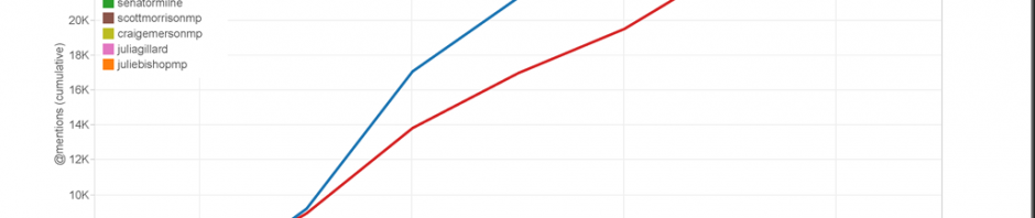
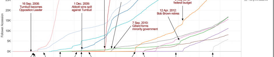
Unsurprisingly, the two main candidates for the Prime Ministership continue to tower well above all others as far as @mentions are concerned. Cumulatively and over the longer term (that is, counting all @mentions since the start of July), Kevin Rudd continues to lead Tony Abbott by a wide margin; a result, most likely, of his greater Twitter follower base as well as of his status as the incumbent PM. Here are the trajectories of the ten most frequently @mentioned accounts since 1 July:

Leaders since 1 July

However, the cumulative figures mainly show the lead in @mentions which Rudd had built up over Abbott during July. Since the election itself was called, the situation is considerably tighter. In terms of the total number of @mentions, Rudd won week one (from calling the election on 4 August to the first leaders’ debate on 11 August), but Abbott led during most of week two:Leaders since 30 July

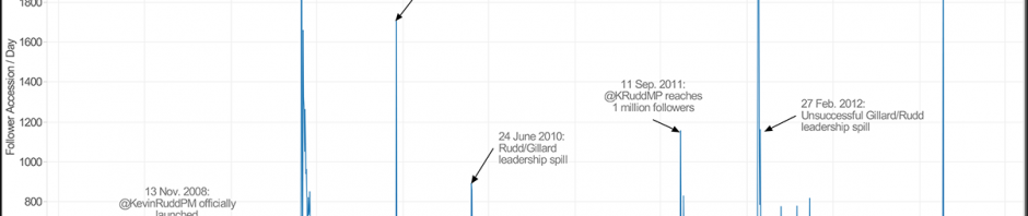
That increase in @mentions doesn’t necessarily imply approval, however, as a brief examination of the spike of activity around Tony Abbott’s account on Wednesday 14 Aug. demonstrates: a significant proportion of the @mentions that day referred to his description of same-sex relationships as “the fashion of the moment”, and/or commented (not always approvingly) on his ABC 7.30 interview with Leigh Sales that night.

Rather than mere support, if the total volume of @mentions indicates the amount of popular attention and scrutiny candidates receive, then the spotlight has firmly shifted towards Abbott during the second week of the campaign. Here is the cumulative picture again, but for week two of the campaign only:

Leaders last week

That’s some 4,000 @mentions more for Tony Abbott over Kevin Rudd during the past week – but again, with the attention paid to Abbott’s comments on marriage equality and continuing discussion of his “sex appeal” comments, those @mentions should not be seen as implying universal endorsement.

Notably, in any such activity patterns around the politicians, there is a strong disconnect from how they themselves are actually using Twitter to get the message out. Of the ten most @mentioned Australian politicians we have identified above, only three – retiring Labor Minister Craig Emerson, Greens leader Christine Milne, and Opposition communication spokesman Malcolm Turnbull – have tweeted an average of more than ten times per day since the start of July, while Rudd and Abbott are at the bottom of the group.

Leaders' tweets since 1 July

Instead of genuinely, frequently engaging with their votes, both Rudd and Abbott appear concerned mainly to maintain a steady level of activity: both have tweeted at least once each day since 1 July, and Rudd has posted up to four tweets per day while Abbott has peaked at seven tweets per day. This may well be a deliberate strategy designed to keep followers connected but avoid message overload, in keeping with these accounts’ obvious interests in reaching as large a constituency as possible. By contrast, the close to 90 tweets per day received from Craig Emerson or Christine Milne on especially active days might well have cost them followers who couldn’t cope with the barrage.

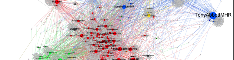
If this points to a divergence in Twitter strategies – a slow but steady approach from the overall leaders speaking to the general populace; more activity and activism from niche players connecting with niche audiences – then this is supported when we identify the most active Australian politicians on Twitter since the start of July. In addition to Emerson, Milne, and Turnbull, the most high-frequency Twitter users are significantly less prominent names: the @NoDirectAction account of Climate Sceptics candidate Bill Koutalianos, whom we’ve seen engaged in arguments with several major party candidates in our network map last week, a handful of second- and third-tier Labor candidates, Batman Greens candidate Alex Bhathal, retiring Independent Rob Oakeshott (whose trajectory ends a little early as he has renamed his account to @RobOakeshott1), and Democrat Senator-turned-Queensland Greens convenor Andrew Bartlett.

Most active politicians since 1 July

The fact that Labor politicians are considerably more strongly represented here than Coalition candidates further supports the suggestion that the latter continue to pursue a comparative ‘small target’ strategy on Twitter, acting from their position as front-runners in the polls. Labor has to catch up, and needs to use social media as well as all other media channels to attempt to do so; the Coalition appears better advised to do nothing than do anything wrong.

And in keeping with this pattern, Labor’s Twitter activity seems to be spread considerably wider than that of the Coalition – a greater number of its rank-and-file candidates are actively using Twitter to try and connect with potential voters. If we aggregate the members’ and candidates’ tweets by party, this is the picture which emerges for the two weeks of the election campaign proper thus far:

Tweets by Parties - since 4 Aug.

ALP and Greens politicians are considerably more active than their counterparts in the Coalition parties (split up here into Liberals, LNP, and Nationals). Also notable are the strong showings from the fledgling Pirate Party and Clive Palmer’s United Party (PUP) – and it should be noted that the Pirates are a late addition to our tracker now that the electoral rolls have closed, so their Twitter activity during the early days of the campaign may well be underestimated here.

So much for a quick overview of the Twitter action so far, then. Coming soon, we’ll take a look at the attention to candidates per electorate, to see where across the country the key election flashpoints appear to be.

ATNIX: Australian Twitter News Index, Weeks 28-32/2013

Seeing as we’re mostly occupied with tracking the use of Twitter in the Australian federal election campaign, this is an ultra-brief update on our Australian Twitter News Index, but it’s one which deserves to be pushed out in between the election coverage in order to keep us up to date. For the sake of brevity, I’ll only report on the headline numbers here.

Update: Georgia Waters at the SMH has kindly cleared up the reasons for the sudden drop-off in Fairfax opinion links we’ve observed in this ATNIX edition. See below for a full update.

Standard background information: this analysis is based on tracking all tweets which contain links pointing to the URLs of a large selection of leading Australian news and opinion sites (even if those links have been shortened at some point). Datasets for those sites which cover more than just news and opinion (abc.net.au, sbs.com.au, ninemsn.com.au) are filtered to exclude irrelevant sections of those sites (e.g. abc.net.au/tv, catchup.ninemsn.com.au). For our analysis of ‘opinion’ link sharing, we include only those sub-sections of mainstream sites which contain opinion and commentary (e.g. abc.net.au/unleashed, articles on theaustralian.com.au which include ‘/opinion’ in the URL), and compare them with dedicated opinion and commentary sites.

See the posts tagged ‘ATNIX’ on this site for a full collection of previous results.

ATNIX Weeks 28-32/2013: 1 July – 11 Aug. 2013

This multi-week update takes in the first full month of the renewed Rudd Prime Ministership, and the first week or so of the federal election campaign – as you will recall, the election was formally called on Sunday 4 August (the final day of week 31). In spite of the significant upheavals over that period (with a barrage of new policy announcements from the federal government, including the PNG deal on asylum seekers), the total volume of links to Australian news sites being tweeted over this period remains somewhat restrained; as far as news sharing on Twitter was concerned, July was a comparatively quiet month. This may well be related to the school holidays which fell into this period in several Australian states.

Additionally, we also see that ATNIX seems to have stabilised itself at a new, lower baseline level since mid-May (that is, week 20) – a point at which Twitter transitioned to a new version of its Application Programming Interface (the service through which we receive our data). The API determines which tweets match our search terms, and it appears that the pattern matching rules have changed (though exactly how they have done so must remain a mystery since these processes are not made public); as we have no influence over these rules, we’ll simply have to accept the fact that the average volume of tweets we’ve received since week 21 represents the new normal.

These preliminaries out of the way, the overall pattern for the past few weeks has been one of stability. There isn’t a significant uptick in activity for the major sites even in week 32 – the first week of the election campaign proper –, and the total volume of tweets linking to Australian news sites over the past four weeks has oscillated around the 135,000 tweets mark (rising only slightly to 142,000 tweets in week 32).

image

But the more interesting story, and the reason why I wanted to get this update out now even though I don’t have the time to present much more than the headline figures, emerges once we single out the opinion and commentary sites and sections. Here, we see a very pronounced slump in the figures for the Fairfax sites Sydney Morning Herald and The Age (and perhaps also for online-only stablemate Brisbane Times, though it’s coming off a low baseline anyway), beginning in week 27.

This slump occurs, incidentally, even though I have switched to a somewhat more inclusive approach to counting opinion and commentary links for these sites. Before, we counted only URLs which followed the patterns smh.com.au/opinion or smh.com.au/comment (and the analogous patterns for theage.com.au and brisbanetimes.com.au), while now we count any link to these sites which contains opinion/ or comment/ anywhere in the URL (e.g. smh.com.au/national/opinion/…).

Yet even under this more generous approach to counting opinion and commentary URLs for these sites, their numbers slump dramatically – for the SMH, for example, from an average of 6,000 tweeted links to its opinion and commentary articles in weeks 1-26 to an average of just over 2,200 links in weeks 28-32. None of the other sites show similar drop-offs: the brief gap for The Conversation in week 28 is due to our temporarily switching back to tracking the old .edu.au rather than .com URL, and the poor performance for ABC Unleashed from week 29 onward is due to a fundamental rewiring of ABC URLs, leaving us unable to distinguish the URLs of news and opinion content on that site. Those technical issues excluded, the slump since week 27 is Fairfax’s, and Fairfax’s alone.

Update: As it turns out, the explanation is a little less dramatic than first thought. As part of the changes associated with the paywall, and with the decommissioning of the National Times, Fairfax’s federal politics opinion articles are now published simply under federal-politics/ URL paths, without opinion/ or comment/ also in the path. As a result, we no longer have any mechanism for picking up such opinion articles for our ATNIX data – similar to a recent rewiring of URL paths at the ABC. Case solved!

The change in URL patterns at Fairfax, alongside that at the ABC, also means that our approach to identifying the opinion content on major Australian news sites is increasingly unsustainable; now that the content paths no longer distinguish between news and opinion, neither can we (at least programmatically, that is). This means that future ATNIX updates will change what opinion figures we report – in future, I think we’ll focus only on dedicated opinion and commentary sites like The Conversation or Crikey for this part of the index.

image


In the absence of major changes to Fairfax’s reporting, or to the structure of its URLs, I can think of only one obvious explanation for this slump, and it’s a fascinating one. On 2 July (that is, on the Tuesday of week 27), the long-anticipated Fairfax paywall was switched on – and it appears that readers of the Fairfax opinion and commentary sections switched off immediately. This mirrors what we’ve observed, some time ago, with The Australian’s paywall – the volume of tweeted links to its content just about halved when its paywall came into effect, too.

Just why this is so in the Fairfax case is puzzling, however – the Fairfax paywall system is a relatively generous one, which allows a fair amount of access from random, casual readers. Contrary to the initial setting of The Australian’s paywall system, too, it doesn’t specifically block would-be readers coming to the site from Twitter. So, just why there is such a strong and evident turn-off remains a mystery to me. Perhaps the most active, most intensive link sharers in the Australian Twittersphere have refused to sign up to the paywall, and the Fairfax site is now missing their amplifier effect – or perhaps the rewiring of the Fairfax publishing system in the wake of the paywall introduction has meant that fewer of its articles are now published under opinion/ or commentary/ site paths (you’ll recall that in the past we’ve seen quite a few comparatively straight news pieces posted under /opinion URLs).

Whatever the explanation, the Fairfax slump means that Australia’s genuine opinion and commentary sites now rise to the top of the heap: The Conversation, Crikey, blogs.news.com.au, and even Independent Australia surpassed the Fairfax opinion sections in week 32. (Here, it’s important to repeat the caveat that The Conversation’s numbers are somewhat inflated by its recent international expansion, taking in audiences from Australia, the UK, and elsewhere – we have no way to separate Australian from UK content at this point.) If sustained over coming weeks, that’s a very significant shift in opinion mindshare…

#ausvotes: Networks of Interaction on Twitter

Earlier this week I posted the first of our analyses of how the Australian federal election campaign is unfolding on Twitter, based on our observation of the tweets from and @mentions of a large number of members’ and candidates’ accounts since 1 July. As an addendum to this post, and covering the same timeframe from 1 July to 11 Aug., here is an overview of the patterns of interaction between the politicians’ accounts and the regular users tweeting at them, illustrated by four network graphs.

We begin with the least surprising observation: in general, most of the Twitter activity is about Kevin Rudd and Tony Abbott. When we simply examine the overall data, containing all the retweets and @mentions of the politicians’ accounts as well as their own tweets, what results is a largely featureless network graph with @KRuddMP and @TonyAbbottMHR in the middle. In the graph below, I’ve included all users who tweeted at or received tweets from the politicians’ accounts at least ten times since 1 July (i.e. degree = 10 or more), and the size of each node represents the volume of @mentions it has received (i.e. its indegree). Click on the graph for a larger version, as usual.

all interactions degree 10

In itself, there’s nothing much to see here yet. We already know from our previous analysis that Rudd receives more @mentions than Abbott, almost by a factor of two, and that together the two party leaders are substantially more often the target of @mentions than any other Australian politician. What’s also evident from the graph above is that – as far as mere @mentioning (including genuine @replies as well as retweets) is concerned – there is no indication of any political partisanship here. Labor, Liberal, and minor party supporters, it appears, are as prepared to @mention the politicians they support as they are to @mention those they oppose. This also reinforces the observation that the volume of @mentions a politician receives on Twitter should not be mistaken for a measure of popularity or approval, then.

However, once we focus on retweets, the situation changes markedly. In the graph below, I’ve filtered out any connection between two users which didn’t consist at least to 50% of retweets – in other words, if user xyz @mentioned user abc ten times, and five of those @mentions were retweets (verbatim or with added commentary), then we retained the connection from xyz to abc; if only four of the ten @mentions were retweets, then we removed the connection. The network which remains now shows much more distinctive features (member and candidate accounts are coloured in their party colours; regular users are shown in grey in this network map):

all retweet interactions degree 10

What emerges is a much better map of political allegiances: the candidate accounts are drawn together here both if they frequently retweet each other, and if a substantial number of everyday users the messages from retweet several such accounts. In other words, much of what we see here is how the Twitter public perceives the parties: Labor and the Greens are more closely connected, with a much bigger gap between Labor and the Coalition parties (Liberals in blue, LNP in a darker blue, and Nationals in dark Green).

Such connections can also be critical, however: the fact that Labor and the Greens are placed close together on the map above also results from the fact that many Twitter users who support, say, the Greens’ stance on asylum seeker policy (by retweeting Greens messages) comment critically on Labor’s policies (by retweeting Labor messages with added commentary). For the same reason, Opposition Immigration spokesman Scott Morrison is located closer to the Labor cluster: both Labor and Greens supporters will retweet Morrison’s messages while adding their own critical views in doing so.

Rudd, Abbott, and many other prominent politicians, on the other hand, are placed somewhat on the outskirts of this map: because they are generally @mentioned so often, they have comparatively few connections in the network which consist predominantly of retweets. Given the filter we have applied to create this map, therefore, they are comparatively poorly connected to the centre of the map above, therefore.

The two maps above are useful for exploring the networks of interaction around the politicians in the overall Australian Twittersphere. However, it’s also worth examining how the candidates interact only amongst themselves. Removing everyday Twitter users from the picture, then, the following graph shows the @mentions (including @replies and retweets) between the member and candidate accounts only:

candidate interactions

Again, this presents a markedly different picture from the graphs above. First, it demonstrates a considerably higher level of activity on the Labor than on the Liberal side – there are more Labor accounts with significant levels of activity, and they appear to be more active in supporting each other through @mentioning. This is consistent with the suggestion that the Coalition continues to pursue a comparative ‘small target’ strategy in its social media activities.

However, the core Labor and Liberal accounts do appear to engage quite readily with each other – questioning each other’s policies and otherwise challenging each other’s statements. Interestingly, both leaders remain somewhat above the fray in this: there are few direct @mentions between Kevin Rudd and Tony Abbott, and the direct @mentions (and thus, attacks) are left to the second and third tiers of candidates – Deputy PM Anthony Albanese (@AlboMP) is locked in a long-term argument with Opposition Broadband spokesman Malcolm Turnbull (@turnbullmalcolm) over the respective qualities of the two parties’ national broadband network solutions, for example, and Opposition climate change spokesman Greg Hunt frequently @mentions Kevin Rudd while Labor Minister for Defence Materiel Mike Kelly does the same with Tony Abbott.

The minor parties pursue different strategies yet again. The Greens accounts are in the first place strongly supportive of each other through frequent mentions, while directing most of their cross-party attention to the two leaders’ accounts; the Katter Party candidate form their own tight-knit group, and only one of them appears to have picked a fight with a Labor MP; the Nationals are surprisingly distant from their Liberal partners in the federal Coalition, and of their opponents mainly engage with Kevin Rudd himself; Clive Palmer’s United Australia Party candidates are much closer to the action, but again focus their cross-party attacks mainly on Rudd and Abbott. Only the sole substantially active account from the climate change denialist Climate Sceptics Party, @NoDirectAction, is targetting its attacks more specifically, tweeting frequently at Minister for Climate Change Mark Butler and Opposition spokesman Greg Hunt (in addition to frequently retweeting messages directed to its own account, resulting in the self-referential loop around the account in the graph above.

But when we focus mainly on the retweets (using the same criterion as above), the network changes once again. Now, the major (and minor) divisions between the parties are clearly revealed, and very few retweet connections cross the party lines; other than in the Coalition, where Liberal, National, and LNP candidates do fairly frequently retweet each other, that favour is otherwise largely reserved for party colleagues. A handful of exceptions do remain, however, most likely again due to retweets which add critical commentary in the process of retweeting:

candidate retweet interactions

So much for now. Over the course of the campaign, we’ll try to return to these graphs again, to see whether they pick up any changes in campaign strategy (or transgressions by candidates goaded into an all-out Twitter war)…

#ausvotes: The Australian Federal Election on Twitter, Week 1

With the Australian federal election finally underway since the official announcement on 4 August, we’re once again tracking the performance the current members of parliament, election candidates, and their parties on Twitter. Over the coming weeks, we’ll try to post regular updates on how the social media campaign is unfolding, and on Monday night I already posted a quick analysis of the controversy over Tony Abbott’s fake followers (which some mainstream media outlets have covered, somewhat implausibly, under the headline “Rudd Admits Spam Twitter Followers”).

I spoke to ABC News 24’s News Exchange programme about the fake follower incident on Tuesday night (starts at around 4:30 into the video).

Here, though, is the first major update on the Twitter campaign. For this, similar to what we did in the 2012 Queensland state election, we’re tracking all tweets from and @mentions of all the candidate accounts we have been able to find so far (and electoral rolls haven’t closed just yet, of course, so there may be some more to come). We’re tracking all major party candidates who are known to be on Twitter, but I should note that we may be missing some accounts from (very) minor party candidates who haven’t made public the fact that they have a Twitter presence. This should not influence the following analysis overly much, however.

Let’s begin with the headline figures. Tracking these accounts since 1 July, we’ve seen Prime Minister Kevin Rudd @mentioned substantially more often than Opposition Leader Tony Abbott, almost by a factor of two; this has been the case especially during the long wait for an election date in the latter weeks of July, perhaps also because of the significant number of new policy announcements Rudd made during that time. The following graph shows their cumulative @mentions since 1 July; both leaders are also well ahead of the other eight most @mentioned Australian politicians during that time, a group which includes former PM Julia Gillard, former OL Malcolm Turnbull, Greens Leader Christine Milne, and various frontbenchers from either side of politics.Leaders - since 1 July

The past few days have seen Rudd and Abbott somewhat more closely aligned. Both leaders’ @mentions spike on 4 August, as the election is called, and of course on 11 August as a result of the first televised leaders’ debate. Rudd still manages to attract some 2,000-odd more @mentions per day on many of the days in between, however, so a certain advantage remains; this may be due to the power of incumbency, to the substantially larger follower base his account has accumulated (even if we don’t count spam and fake followers for either leader’s Twitter account), and to the highly personalised ‘Kevin 24/7’ campaign strategy which once again seems to be at the heart of the Labor campaign. Interestingly, some of the other prominent politicians appear to be @mentioned somewhat counter-cyclical: Hockey’s, Albanese’s, and Turnbull’s numbers all rise on the days after the election announcement while Rudd’s and Abbott’s fall.

Leaders - since 30 July

We’ll probably end up doing a separate post about the performance of the leaders’ accounts during last Sunday’s debate in a few days, but for now, here’s a graph of the minute-by-minute @mentions of the leading accounts over the course of the debate. For the most part, both are neck and neck, although it is also obvious that Rudd’s @mentions per minute spike a great deal higher than Abbott’s. This should not be translated immediately into “Rudd won the debate”, of course – @mentions may be used to express disapproval as much as support, after all. Also of note is the notable rise in mentions of Greens leader Christine Milne during the debate – time to change the format and include some of the minor parties in the debate, perhaps?

Leaders - during 11 Aug. debate


But in addition to the leaders themselves, of course we’re tracking all the candidates’ accounts that we know of. This also makes it possible for us to aggregate Twitter activity around those profiles by party and by state. Here, the sheer volume of @mentions of Rudd and Abbott clearly puts ALP and Liberals well ahead of all other parties, and the ALP well ahead of the Liberals due to Rudd’s higher numbers:Parties - since 1 July

That gap narrows somewhat once those two leaders are removed from the equation – the following graph shows the cumulative volume of @mentions for all accounts except for @KRuddMP and @TonyAbbottMHR, and thereby better represents what happens outside the presidential-style part of the campaign:

Parties - since 1 July (KR&TA excluded)

Despite the greater prominence of Coalition frontbenchers amongst the most frequently @mentioned Twitter users which we have seen in the first graphs above, then, on aggregate ALP candidates still appear to be @mentioned substantially more than their Coalition counterparts. This may reflect the aftereffects of what has long been a small target strategy as far as the social media use of Coalition rank-and-file candidates was concerned; except for a handful of frontbenchers, they’re not very prominent on Twitter and therefore don’t receive many mentions.

The story for the states is similar. Here, because of the location of Rudd’s (Griffith, Queensland) and Abbott’s (Warringah, NSW) electorates Queensland and New South Wales are well ahead any other state; because of the greater number of prominent other politicians from NSW, that state is just slightly ahead of Queensland (though I doubt that this is much of a consolation for eight years of Origin defeats…).

States - since 1 July

If we remove Rudd and Abbott from the picture once again, though, it changes considerably. New South Wales politicians’ accounts remain widely tweeted about, while Queensland drops way back – a very drastic illustration of the fact that, Bob Katter, Clive Palmer and (now) Peter Beattie notwithstanding, Rudd remains the only truly prominent tweeting federal politician in the Sunshine State. Similarly, it also shows the considerable influence that NSW politicians continue to wield on both sides of the political divide – and with Queensland out of the picture, Victoria assumes second place even though the removal of Julia Gillard has considerably reduced the prominence of its politicians.

States - since 1 July (KR&TA excluded)

So much for a first, quick, analysis of overall tweeting patterns around the candidates, then. In the next few updates, I’m aiming to look more closely at which electorates are seeing a lot of Twitter activity, how the candidates themselves are tweeting, what networks of interaction emerge between and around them, and what themes are notable in the content of the tweets. Stay tuned!

Australian Reality TV on Twitter: A Two Horse Race

Last weekend provided an opportunity to compare the three currently running Australian reality television series, and their social media presence, with Big Brother Showdown on Saturday night, and both X-Factor and Masterchef airing on Sunday. For current purposes, analysis uses the official hashtag of each show, which will exclude a number of tweets using #bigbrother (which may also refer to the currently running US series), #masterchef, #xfactor etc.

X-Factor was the clear winner of the Saturday night battle, doubling up Big Brother which was at a season low for average tweets per minute.  Masterchef however rated terribly on Twitter:


If, however, we give Big Brother the benefit of the doubt, and take a more typical show (in this case Thursday 2 August) rather than the Showdown format, it looks more competitive, able to keep pace with X-Factor and generating more tweets through airing over a longer period, with Masterchef still lagging well behind the other two, as the following graph (which timeshifts all shows to an identical ending point) demonstrates:


Finally, all three shows aired over a two hour period on Monday night, with a similar story to the time-shifted graph above:


There are a few interesting things here: the poor showing of Masterchef, the high peak of Big Brother in comparison to the other shows, but also the increase in Big Brother tweet volume as X-Factor concluded, which suggests a significant social media overlap between the two shows.

Big Brother Australia Update

Episode 4 of Big Brother Australia (Thursday night) followed much the same pattern as Wednesday’s discussed previously, with approximately 7,200 tweets over the hour of the broadcast, peaking at 164/min. It is worth noting that the array of different Australian timezones do have an impact on these totals, and because of the overlaps it is difficult to separate them as I have with the US broadcasts. However, as discussed last time the peaks do correspond to the Eastern Time zone viewing, which is what I will concentrate on here.

That said, here is the graph for Episode 4 from Thursday night:


In Australia this season, Friday Night football means a reduced 30 minute show on Friday. with the show also suffering from a major drop in ratings. While  Monday’s premiere reached 1.31 million and subsequent daily shows hovered around 1 million (1.04, 1.03 and 0.98), Friday’s show only reached 0.73m viewers.

Here is what it looked like on Twitter, with only 1326 tweets over the 30 minute broadcast (+ 5 minutes either side), peaking at 70/minute:


Saturday saw the launch of ‘Big Brother Showdown’, a re-imagined version of ‘Friday Night Live’, which seemingly did not resonate with viewers, with a new series low of 0.68million viewers. The twitter performance was similarly down, with 1,797 tweets over the 1 hour broadcast (+ 5 mins either side), and a peak of 76/minute:


Significance of a Live Feed:

While there are many differences between Big Brother in its various international incarnations, one of the most significant from a viewer engagement perspective (at the very least, this viewer) is the lack of a Live Feed during the return of both the UK (after the move from Channel 4 to Five) and Australian (Ten Network to Nine) series. Fans of the show have long made the argument that this impacts detrimentally on viewer engagement, while producers have argued that such a service is not cost effective in Australia, and that may well be true, however large numbers of viewers continue to complain each year.

Given the US (which maintains a live feed, on a subscription basis) and Australian series are currently running concurrently, I thought it might be interesting to look at the engagement / discussion on Twitter of both shows before and after  their broadcast slots. Even allowing for population / Twitter population differences (The US series is watched by almost 6x as many people, and has in-show peaks of around 2-4x the Australian broadcasts), the effect is obvious. While the Australian broadcast is lucky to receive 100 tweets/hr during the afternoon before a show, the US is hovering at 1000-2000, putting news from the show in front of a much wider Twitter audience.

The graph below takes advantage of a new TimeShift formula (utilized above to compare Australian Reality TV shows) to match Australia to US Eastern Time. I’ve also cut off the top of the Big Brother show from Thursday and Sunday nights (US Time) , which peaked at 65,000/hr and 25,000/hr respectively, in order to increase visibility at the lower end of the graph. As you can see, discussion of the US Live Feed on Twitter was greater than discussion of Saturday Night’s television show in Australia, and the two were fairly close for Friday night also:


When considering the viability of Live Feeds, such a social media presence cannot be ignored, and I continue to suggest that live feeds for reality TV shows are a weapon producers should use to their (social media) advantage.

Factcheck: Did Tony Abbott Buy Twitter Followers?

This past Sunday evening, the first reports emerged of a rapid and unusual increase in the number of Twitter and Facebook followers for Australian Opposition Leader Tony Abbott. An overall increase in followers during an election campaign is far from surprising, as our analysis of the follower growth curve for leading Australian politicians from June shows, but this latest increase happened a little too quickly to appear genuine.

So, what happened here? Did Abbott buy himself some additional Twitter followers, or did some 60,000-odd Twitter users suddenly develop a burning desire to follow Abbott’s tweets?

To shed some more light on those questions, this Monday morning we quickly re-ran our follower analysis for Abbott’s account. I’ve explained the overall approach to doing this in an earlier post, but here’s  quick re-cap: the following graph shows the relative age of the Twitter accounts following @TonyAbbottMHR, plotted in the order in which they followed the account. In doing so, we draw on the fact that Twitter helpfully lists followers in the order of what we have come to call their ‘accession’: from Abbott’s first followers all the way through to his most recent.

What results from this analysis is the following graph. A clear shape emerges, and the top edge of that graph shows the approximate number of followers Abbott had at any one point in time (with the caveat that we cannot see any past followers who have unfollowed Abbott again). The flatter the curve, the more rapid the follower accession. (As always, click the graph for a larger version.)

Tony Abbott Follower Growth

Especially in recent times, the curve is fairly flat, but not entirely horizontal. Also, there are long vertical tails below each point of the curve, indicating that at any one point in time Abbott added a mixture of well-established as well as newbie Twitter users.

However, that situation changes for Abbott’s most recent followers, to the right of the graph – users who joined in the last few days. Here, the follower accession curve is virtually horizontal, indicating a very rapid growth in new followers – and those new follower accounts were created almost without exception within the last 60 days or so (in fact, the creation dates are so systematic that there appear to be two banks of followers, one at around 60 days of age, the other about half as old).

This is irrefutably dodgy. There is no logical explanation for some 60,000 Twitter users, all of whom joined the platform at almost exactly the same time, to follow @TonyAbbottMHR in unison. The only realistic scenarios are that a) someone from the pro-Abbott camp decided to boost the Opposition Leader’s numbers on Twitter by buying his account some fake followers, b) one of his opponents did the same in order to exploit the publicity which has resulted from this suspicious influx, or c) independent of any political motives, a fake follower network operator decided to give their zombie accounts some appearance of legitimacy by connecting them with a genuine, prominent account.

Time for a factcheck, then – did Abbott buy himself some Twitter followers? We cannot say for sure; given how obviously these new followers stand out from the crowd, it would be a very ill-considered and simple-minded attempt to claim some popularity on Twitter. It’s just as likely that these followers were bought to hurt Abbott as that they were meant to help him. Are they fake? Yes, undoubtedly; a follower accession curve as we see it above does not occur in the wild.

And it looks like the Abbott camp, as well as Twitter itself, have also realised this: from the heady heights of 210,000+ on Monday morning, Abbott’s numbers have dropped down again to some 170,000 by Monday night, as Twitter has removed, blocked, and/or deleted these fake accounts.

We have, incidentally, seen a similar phenomenon for Kevin Rudd’s @KRuddMP account in the past, too, as I’ve noted in a previous post. Rudd’s numbers grew remarkably quickly between late June 2009 and late January 2010, leading to similar suspicions of follower buying at the time. Here’s Rudd’s follower accession curve:

Kevin Rudd Follower Growth

However, the most likely explanation for the substantial number of followers which Rudd added during that time is a little more complicated: in June 2009, Twitter changed its account sign-up procedures and increasingly pushed new users to start following prominent Twitter celebrities immediately, as part of the account creation process. For a while, you could hardly create a new Twitter account without following at least a handful of these suggested users.

As it turned out, Kevin Rudd – then as again now the Prime Minister, of course – was one of these suggested users, and benefitted immensely from such free promotion: he added over 600,000 followers to his account. And again, those 600,000+ are only that subset of all new followers from that period who are still following Rudd today; many more might have followed him at the time and unfollowed later.

In Rudd’s case, then, we can say with some certainty that his numbers may have been (and continue to be) inflated by such unexpected effects of platform functionality, but that fake followers do not play a significant role in his case. For Abbott’s account, the situation is clearly different, even if we may never find out who was responsible for this sudden flurry of new followers.

Big Brother 15, West Coast Viewers & Guilt by Association

Over at my own blog, I have been running an almost-daily series of posts looking at the current US reality series “Big Brother”, now in its 15th incarnation in the US (the 10th Australian series starts in a week or so). While I’ll direct you there for all of the details, here is a brief summary of the more interesting findings from the first couple of weeks of tracking the #bb15 hashtag (and associated terms, including #bblf (Big Brother Live Feed) and @cbsbigbrother).

Controversy provokes Tweets more than regular ‘game-show’ mechanics

Big Brother 15 has, since the first few shows, been beset by racism, sexism and other scandals, which they finally decided to air publicly on the 7 July CBS Broadcast, as I discuss here. The segment of the show in which the comments were aired heavily outranked the remainder of the episode in terms of tweets (peaks of 340/min vs. 100/min for other segments), and even attracted a West Coast audience (with peaks of 140/min), which as I will shortly discuss, is not a regular occurrence. This suggests that perhaps a wider audience was attracted to the show because of the airing of these segments, and the ratings for the show since the 7 July broadcast suggest that some of that audience stuck around – perhaps any publicity is good publicity.

BB_7JulyShow_Trendline

[Note: This graph is not directly comparable to the ones that follow, as it used a previous version of our Twitter capture process]

The word map for this episode also clearly shows the dominant themes, with the main protagonist (Aaryn) and Racism both featuring heavily.

BB_7JulyShow_WordMap

But, generally West Coast Audiences don’t tweet about tape delayed shows

Across all of the episodes, except the one portraying the racism scandal discussed above, a constant theme has been the lack of attention given to the West coast tape delayed broadcast of Big Brother. While the airing does show a noticeable spike in the traffic, this is from about 50 tweets per minute when the show is not airing (which is primarily discussion around the 24/7 live feed) to 100/minute, with peaks at 1/3 or 1/6 of East Coast levels, which is far greater than population alone would suggest:

10 July (More detail):

minutebyminute-corrected

21 July (More detail):

showbyminute


There are a couple of possible theories for this; one is that many of those who care enough to tweet about the show care enough to find an East coast stream, and that this may be true more broadly, so that for sitcoms and other shows those wanting to join a conversation about an episode watch online, just as viewers overseas might. Another theory is that those tweeting about the show overlap heavily with those tweeting about the live feed, and as such many West Coasters would rather watch the live feed than the broadcast show; in which case this may be a phenomenon unique to Big Brother (and/or other reality shows with a live feed); I don’t have the data to draw a firm conclusion on that yet.

They care about tape delayed live shows even less

if you thought those graphs looked bad for viewer engagement from the perspective of West Coast broadcasters (and advertisers!), the live show figures are even worse. Each Thursday, the Big Brother eviction show is aired live on the East Coast, and tape delayed on the West Coast. While a power cut cost us the data from 11 July, Jeremy’s eviction on the 18 July was captured, and saw the West Coast airing of the show struggle to achieve 10% of the tweet volume of the East Coast broadcast (and the West Coast broadcast figures include people discussing the live feed, which is blacked out during the East Coast broadcast):

showbyminute

Guilt by (Twitter) Association carries into the media sphere

Separate from the raw analytics relating to each episode, I have also begun taking a look at the content of the tweets, in an aggregated form. Utilizing some methodology that my CCI colleague Axel Bruns has outlined, I took a look at tweets surrounding three houseguests who formed an early alliance called the “Triangle of Trust”, including Aaryn who was associated with the racism scandal discussed above. A theme of the Tweets (which I won’t quote specifically to avoid personal identification) and press reaction (See, for example, CNN/JeremyDaily Mail/Kaitlin) to-date is ‘guilt by association’, by which I refer to the degree that other housemates, particularly Jeremy and Kaitlin (who formed the ‘Triangle of trust” with Aaryn) have found themselves associated with remarks they didn’t make. A fuller description of what I did is in the longer post at my blog, but in summary a dendogram of terms and their proximity showed the association between different terms:

dendogram

The same data can also be visualized as a 2D map of the terms, in which the closer they are, the greater the association:

2dmap

And finally, the following chart shows how the terms associated with the three houseguests were distributed across the alliance members:

proximity_Triangle3

Big Brother 15 has proved an interesting test-case and proof-of-concept for me, in terms of both the current version of our Twitter capture software and also some additional analysis tools. I’ll continue to update on my own blog, and report back here when there are some significant findings.

ATNIX: Australian Twitter News Index, Weeks 20-27/2013

Once again, too much time has passed between ATNIX updates; I hope to return again soon at least to regular monthly posts, but for the moment, this will need to be another two-month update. Several circumstances have combined to cause delays this time around: for one, Twitter finally transitioned to a new version of its Application Programming Interface, which is our source of data for link-sharing activity, and we needed to make sure our data-gathering systems had successfully transitioned as well and continued to produce reliable data. Second, we have also been struggling to track the repositioned Conversation (now at .com rather than .edu.au), and have been trying to find a way to track links to the newly-launched Guardian Australia. And finally, the dramatic political events of the recent weeks in Australia have meant that our focus in processing and analysing Twitter data has been on more pressing matters – for example, our initial study of the use of Twitter in tracking the Labor leadership #spill, and our investigation of how and when leading Australian politicians gained their Twitter followers. Oh, and then there’s our report on Social Media in the Media, examining the coverage of social media in politics by mainstream newspapers in Australia.

These excuses out of the way, then, let us return to the matters at hand: our ATNIX trends for mid-May to mid-July. First, some words on our two problematic sites: The Conversation makes a welcome return to the index with this update, but some caveats do apply. You may recall that the site all but disappeared from the index in week 13, due to its move from a .edu.au to a .com domain as part of its internationalisation push. From July onwards, we are now tracking theconversation.com once again, and the site puts in a strong performance; however, it should also be noted that its growing stature in the UK and elsewhere (and the addition of UK contributors to its author base) also means a comparative inflation of its numbers: links to The Conversation are now quite likely to be shared by many non-Australian Twitter users as well. To some extent, then, The Conversation is an apple when most of the other opinion and commentary sites and sections we’re tracking in ATNIX are oranges – however, as we’ve seen especially in the context of major international stories in past ATNIX updates, quite a few of the other Australian sites get their share of international readers as well.

Tracking the freshly-launched Australian version of The Guardian is even more problematic at this point, and it remains excluded from ATNIX for the time being, therefore. We gather the raw Twitter data for ATNIX on the basis of base domains (such as abc.net.au), but for now, Guardian Australia is hosted at guardian.co.uk along with its parent newspaper. And while the Australian version’s front page is located at guardian.co.uk/australia, most of its Australia-specific content (such as, for example, Lenore Taylor’s column) is posted under guardian.co.uk/world or similar site paths. So, at present there is no opportunity to reliably distinguish links to Guardian Australia content from links to the UK or US editions of The Guardian – and comparing the global volume of Guardian-related tweets to tweets that reference domestic Australian news sites would take us well past apples and oranges. If – as has been suggested – Guardian Australia eventually moves to guardian.com.au (currently a site selling home safety systems) or some other local domain, we’ll be sure to include it in ATNIX, of course.

Standard background information: this analysis is based on tracking all tweets which contain links pointing to the URLs of a large selection of leading Australian news and opinion sites (even if those links have been shortened at some point). Datasets for those sites which cover more than just news and opinion (abc.net.au, sbs.com.au, ninemsn.com.au) are filtered to exclude irrelevant sections of those sites (e.g. abc.net.au/tv, catchup.ninemsn.com.au). For our analysis of ‘opinion’ link sharing, we include only those sub-sections of mainstream sites which contain opinion and commentary (e.g. abc.net.au/unleashed, articles on theaustralian.com.au which include ‘/opinion’ in the URL), and compare them with dedicated opinion and commentary sites.

See the posts tagged ‘ATNIX’ on this site for a full collection of previous results.

ATNIX Weeks 20-27/2013: 13 May to 7 July 2013

ATNIX trends for the past eight weeks reveal a curious pattern: since week 20, there’s a pronounced drop in link sharing activity on Twitter, across all sites. When for weeks 1-19, the weekly average of links to the news sites remained at just under 170,000 tweets, for weeks 20-27 we counted an average of some 140,000 tweets per week, and there is no obvious explanation for this decline. One possible explanation is the Twitter API changeover in mid-May, which may have affected the total volume of tweets matching our URL search terms which are now delivered to us; if so, we must simply accept that this lower level will be the new baseline for our week-on-week comparisons. However, during the second half of 2012 we did see a similar temporary slump in Twitter activity around the Australian news sites, between weeks 35 and 40, so it is not inconceivable that other, external factors are to blame for the present drop-down as well.

image

At any rate, even at their reduced volume the past two months see a continuation of a recent trend that has ABC News ahead of its nearest competitor, the Sydney Morning Herald, and second-tier sites The Age and news.com.au competing neck-and-neck for third place. Interestingly, there is also a pronounced further slump for SMH and Age in the final week, and we will keep close watch of whether that slump continues into the future: on 2 July 2013, at the start of week 27, Fairfax introduced its long-foreshadowed paywall system which – while providing readers with a comparatively generous allowance of 30 articles per month before the paywall kicks in – may result in a reduction of tweets linking to such paywalled content (we have seen a similar reduction in the past when The Australian introduced its paywall, for example). However, as the non-paywalled ABC News also declined in week 27, it’s too early to say for sure what’s to blame for the Fairfax slump that week.

The day-to-day breakdown sheds further light on news-sharing activity during the past couple of months. We can see clearly the drop-off in overall activity since week 20, but also the relatively steady overall tweeting patterns over these weeks:

image

The high point of this period, of course, is week 26, which saw the dramatic events in the Australian Labor Party that led up to the eventual leadership challenge and change on 26 June. Here, the SMH puts in a handful of comparatively strong days, even if the total volume of news tweets captured by ATNIX barely exceeds that of the surrounding weeks – an indication, perhaps, that (especially compared to the surprise spill of 2010) the 2013 leadership change had been a long time coming, and was therefore more strongly a television than a newspaper/online media event, with less pronounced effects on the volume of tweeted news links. Indeed, of the 5,700 tweets linking to ABC News content on 26 June, some 10% linked simply to the ABC News 24 Website which carries its live stream.

Curiously, the major peak for the SMH over the past eight weeks (and the one day that it surpassed ABC News at least temporarily) was caused by a brief piece about the new oldest man in the world, Jiroemun Kimura, who is now the only male remaining to have been born in the 19th century. It caught the attention of US blogger Matt Drudge, whose tweet linking to the article was widely retweeted and resulted in a variety of follow-on tweets also linking to the article – adding up to some 1,050 tweets on 28 May alone.

The extraordinary political events of week 26 are more clearly reflected in the link-sharing patterns for our Australian opinion and commentary sites and sections, which do show some significantly increased activity during weeks 25 and 26. Here, the two Fairfax sites continue their reign as the leading Australian performers – but in week 27, The Conversation (now as a .com domain, and with its numbers somewhat inflated by its new-found international audience) makes its return to ATNIX at number one with a bullet, while the Fairfax sites slump down considerably, possibly due to the new paywall.

image

Much of the ramping-up of Fairfax activity during weeks 24 to 26 can be attributed to the increasing Labor leadership speculation during that time; the daily patterns pinpoint the key moments during this time in even greater detail, and again highlight the heightened levels of activity especially on 26 June.

image

On the day of the challenge, the Sydney Morning Herald’s politics live blog leads the way, with some 650 tweets linking to it; the 27 June edition of the live blog adds another 100+ tweets to the count. First commentary pieces, such as a critical article by Anne Summers on the bullying of Julia Gillard, on 27 June, also receive substantial attention (320 tweets) – but more tangentially related articles, such as a story on the links between Joe Hockey and failed Peter Slipper accuser James Ashby, also manage to cut through (200 tweets on 27 June). And there’s plenty of other commentary about the leadership change and its implications which was widely shared during those days, of course – and more to come as we creep towards the election (whenever it may be), no doubt.

Finally, though, a quick look at a most unusual spike in activity around the normally rather dormant Brisbane Times opinion section: on 18 June, it briefly ascended to the heady heights normally reserved for its more illustrious Fairfax stablemates. This was due to an opinion piece by author John Birmingham, adding together the various acts of outright misogyny (against Julia Gillard, Nigella Lawson, ADF cadets, and others) to berate and berant the troglodytes behind such offensive behaviour en groupe. Clearly, he hit a nerve: all but 40 of the 740 tweets referencing the Brisbane Times opinion section that day linked to his article. Well done that man.

Follower Accession: How Australian Politicians Gained Their Twitter Followers

This post follows on from a number of research activities we’ve covered here in the past. Last week, we released our CCI report Social Media in the Media, which shows the gradual acceptance and integration of social media into the practices of political communication. And in my last post, I outlined a new method for retrospectively determining the follower growth for specific Twitter accounts, using the account of former Australian Prime Minister Kevin Rudd as a test case.

The logical next step, then, is to trace how social media have been adopted by Australia’s leading politicians over time, and how the public have responded to them. We do so by examining the Twitter careers of a dozen key Australian federal parliamentarians on the basis of their follower accession patterns – which shows when these leaders first began to experiment with Twitter as a platform for political communication and reveals a number of key moments of heightened Twitter growth. (As with the previous post, we gathered these data before the recent Labor leadership change back to Kevin Rudd, so they don’t yet take into account the impact of Rudd’s return. Gathering these data is a slowish process, so we’ll follow up again with a look at the impact of the latest spill later.)

As outlined in my post which introduced the idea of Twitter follower accession graphs, we’ve sought to filter what appear to be spam followers by excluding any accounts which followed their target account within 90 minutes of being created; this may have removed a number of genuine followers as well, but as it’s done so across all accounts it won’t affect the validity of our results. Also, the obligatory caveat: through this method, we can only estimate when current followers joined. There is no way to capture when ex-followers joined or left again.

To begin with, then, let’s get a sense of the overall trajectories of the twelve accounts:

Combined - overall follower growth (first 50,000)

The graph above clearly shows the advantage of incumbency: both former Prime Minister Kevin Rudd and his successor Julia Gillard have managed to attract substantially more followers than their former and current opponents, Malcolm Turnbull and Tony Abbott – even in spite of the latter’s commanding lead in recent opinion polling. The incumbents’ roles in actual (rather than just shadow) government may explain this to some extent; Twitter followers, at home but especially also outside of Australia, may not be as interested in the Twitter feeds of the challengers until they assume power. (Another explanation may be that progressive politicians are currently ‘better at Twitter’ than conservatives; we’ll only be able to explore the validity of that suggestion after a change of government, however.)

The incumbency thesis is strengthened especially by the rapid increase in the number of followers for Julia Gillard in the weeks after her successful challenge to Kevin Rudd. Gillard joined Twitter considerably later than Rudd, Turnbull, Abbott, and several other leading politicians, but within a month of becoming PM had surpassed all but Rudd in her number of followers. This steep follower accession curve becomes even more obvious if we focus only on the first 50,000 followers for each account – which also helps us identify a number of early events in the follower careers of these accounts:

Combined - overall follower growth (first 50,000)

The use of Twitter by leading Australian politicians clearly begins in earnest towards the end of 2008; the annotations below the graph show the Twitter join data for each of our dozen leading politicians. Then Opposition Leader Malcolm Turnbull and Prime Minister Kevin Rudd are amongst the first to set up accounts (and are joined in this by Rob Oakeshott, at that time a comparatively unimportant independent MP). Neither immediately gain substantial numbers of followers, which leads me to assume that they experimented with Twitter as a medium for political communication for a little while – perhaps even under a pseudonymous Twitter handle, or using a ‘private’ Twitter account – before making their accounts public.

The difference between Rudd and Turnbull – and with it, the power of incumbency – is also evident from the graph above: while the Prime Minister’s account goes stratospheric soon after its existence becomes known, the Opposition Leader’s follower numbers grow steadily, but at a much slower pace. We’ll see this repeated with Julia Gillard’s follower numbers in 2010.

The next major event, though, is Tony Abbott’s assumption of the Coalition leadership on 1 December 2009, as Turnbull fails to recover from his role in the Utegate affair and narrowly loses a leadership ballot. Abbott’s own Twitter account is created that very day, and almost immediately picks up some 1,500 followers; new Shadow Treasurer Joe Hockey also gains a similar amount of new followers, while somewhat perversely Turnbull’s follower curve also ticks up. (Again it should be noted here that we cannot determine when previous followers unfollowed an account, though – it’s possible that Turnbull lost more than he gained on that day, therefore.)

The next spill, then, is in the Labor ranks, as Julia Gillard succeeds Kevin Rudd (at least temporarily, as we now know). Interestingly, Gillard had had a Twitter account since late October 2009, but had picked up virtually no followers; this is likely a sign that the account had been using a name other than @JuliaGillard for its first months of existence, and/or that it had been set to ‘private’ rather than public. It’s only with Gillard’s ascension to the top job that her account is made public and rapidly gains followers; between the 23 June spill and the 21 August 2010 election, her follower accession curve is perhaps even steeper than Rudd’s when his account was first launched. Notably, the election itself also plays an important role in this: Abbott, Hockey, Turnbull (somewhat surprisingly, perhaps), and even then-Deputy Greens leader Christine Milne all experience above-average follower growth during this time.

The hung parliament in the weeks after the election provided a chance for less well-known political actors to take centre stage in Australian politics; this is true for the political scene on Twitter as well. Independent and now kingmaker Rob Oakeshott’s @OakeyMP account had been created in mid-October 2008, as one of the earliest of the dozen accounts we’re examining here, but had failed to gain any significant audience; as soon as his crucial role in deciding the next Prime Minister of Australia became clear following the election, however, a substantial number of Twitter users began to follow him. This trend continued for some time, but as it became clear that in spite of its precarious electoral situation the Gillard government would be a stable and (almost) full-term one, follower growth appears to have slowed down somewhat.

Buoyed by their colleagues’ experience, perhaps, we see some further leading politicians join Twitter in subsequent months. (Then) Deputy PM Wayne Swan is one of the next to join, and gains followers at a somewhat faster rate than many of his colleagues; especially in 2012, there’s also a pronounced uptick as he delivers that year’s federal budget to the nation. Bob Katter, Craig Emerson, and – somewhat belatedly – one of the other key independents, Tony Windsor, also follow suit. Between them, Barnaby Joyce’s Twitter account (created in February 2010, but apparently not made public until September 2011) also finally takes off. And as always, leadership changes boost follower numbers for their beneficiaries: new Greens leader Christine Milne gains from Bob Brown’s retirement, for example – on Twitter as much as in other ways.

As I’ve noted above: we gathered these data in mid-June, before the most recent Labor leadership challenge and the return of Kevin Rudd as Prime Minister. That event, both because of the use of Twitter in commenting on the spill and because of the added attention to the various politicians’ Twitter accounts that it would have brought, will have had a further effect on the follower numbers of these accounts. Additionally, we’ll also expect to see a number of account renamings in its wake – a Twitter handle like @SwannyDPM is no longer accurate, for example, and who would be surprised if @KRuddMP became @KevinRuddPM again?

Such name changes to existing accounts don’t affect follower numbers directly, but their press coverage might – so we’ll wait until the dust has settled and will re-examine the most recent follower accession trends in a new update in the not-too-distant future.

Introducing Twitter Follower Accession Graphs

It’s been uncommonly quiet on this site for the last few weeks, as we’ve been busy with various projects, and overseas for a range of research activities. This may well prove to be the calm before the storm, though – we have a number of very exciting new social media research outcomes in the pipeline, and our preliminary analysis of Twitter use in the latest Labor leadership spill a couple of weeks ago was just the start.

To rekindle our interest in new methodological advances in Twitter research, here’s a new method which my colleagues Darryl Woodford, Troy Sadkowsky and I came across on Tony Hirst’s fabulous blog OUseful.info a few months ago – and as Tony points out, there’s also a Microsoft Research paper which pursues a similar approach, so this method may have been developed almost simultaneously by a number of researchers. What we’re about to do is quite possibly more difficult to explain than to demonstrate, so let’s start with an illustration which shows the followers of former reinstated Australian Prime Minister Kevin Rudd’s account @KRuddMP.

(We gathered these data before Rudd’s return to the top job, so any effects of the latest Labor leadership change won’t show up here just yet – we’ll examine these new changes in a future post, once the dust has settled.)

The following graph draws on two key points. First, the list of current followers for any one account which is returned by the Twitter API is in (almost) perfect chronological order; in Rudd’s case, from follower number one to follower 1.2 million or so (at the time we gathered the list). Following Tony’s example, we call the position of each follower in the overall list their follower accession number. Second, through a different API request we are able to determine when each of these followers first joined Twitter, practically down to the second they joined – that’s their account creation date. If we plot those two parameters against one another, this is what we get (as always, click on the images to access larger versions…):

KRuddMP-plain

It’s immediately obvious that a curve emerges which looks suspiciously like a growth curve for Rudd’s follower base. As Twitter tells us, Rudd joined on 18 October 2008 – quite possibly without using the @KevinRuddPM username at the time; that handle was revealed only on 13 November that year, it seems, and changed to @KRuddMP after he lost the leadership to Julia Gillard in June 2010 (the existing follower base remains unaffected by such renamings of a Twitter account). Soon after, he began to accumulate followers, and his numbers swelled rapidly from mid-2009 onwards.

But why this pronounced curve, when (in principle) Twitter accounts of any age could become followers at any time? Well, here’s the clever bit of logic that Tony Hirst came up with:

  1. None of the follower accounts could become followers before they themselves were created.
  2. Some of the follower accounts will have become followers quite shortly after they were created – within minutes or hours. (This is even more likely in recent times, since Twitter began recommending high-profile accounts that new users may find interesting to follow.)
  3. Thus, the lower edge of the graph above is a pretty good approximation of the size of the follower base at any one moment – and we’re able to trace over time how an account’s follower base has developed.

In other words: from time to time, an account will follow @KRuddMP very shortly after it itself has been created. This means that any new followers joining after that account must have followed @KRuddMP at a time after that date; we are therefore able to calculate an approximate join date for those accounts even if their own creation dates are well in the past. Going through the list of followers from number one to number 1.2 million, noting down each most recent account creation date we come across and assigning it as a join date to all later followers until we come across an even more recent account creation date, we are effectively tracing @KRuddMP’s follower growth curve, then. (See – I did say this was easier to illustrate than to explain…)

As long as the target account itself remains the same, this works, incidentally, even if the account has been renamed – as is the case here, since we know that @KevinRuddPM changed its name to @KRuddMP following the 2010 ALP leadership spill. Interestingly, a pronounced vertical line also emerges – most of Rudd’s follower accounts were created after February 2009 or so, while the space to the left of that line is comparatively empty. This isn’t unique to Rudd, however: overall, most Twitter accounts in the world were created after that time, as the site emerged as a mass medium, so the darker shading to the right of that divide simply shows when Twitter itself became a popular social media platform.

There is one significant caveat, however: gathering an account’s list of followers, we only gather information about those followers who at present still remain as followers. If there was a large group of followers who left at some point before we gathered our data, we will not find any evidence of that exodus; we can only see when those followers who have stuck with the target account until now began to follow it. (Also, if someone followed, unfollowed, and then re-followed an account, we will only be able to see their presence since the last time they re-followed.)

There’s also a smaller issue with the Twitter API which seems to result in some recent followers to be placed (erroneously) at the start of the list – in Rudd’s case, there are a few accounts which were created in 2012 that show up amongst Rudd’s first few hundred followers, which is obviously impossible. So, we’ll ignore the first few followers in the list from now on. On that basis, then, If we isolate the growth curve only, here’s what we’re left with:

KRuddMP-growth curve

Spam Followers?

But something’s not quite right yet. The Rudd graph above shows a very rapid growth in followers which seems to begin as abruptly as it ends. Between late June 2009 and late January 2010, @KevinRuddPM (as it was known then) picked up a whopping 700,000 new followers, for no obvious reason; its follower accession rate was substantially smaller both before and after this time. Here’s the account’s estimated follower growth per day:

KRuddMP-growth per day

A closer look at some of the accounts which joined during this time reveals some unusual patterns. Many of the new follower accounts began to follow Rudd essentially within minutes of being created; many follow only a handful of other accounts, and usually those of celebrities such as @PaulaAbdul and @CindyCrawford; many never bothered to change their Twitter user avatar away from the default ‘egg’; many posted only a handful of times, often promoting mail-order pharmaceuticals or ‘guaranteed followback’ schemes; and many haven’t tweeted again since 2011 or so. In short: these clearly aren’t genuine followers, but spam accounts which are attempting to give themselves the veneer of respectability by following a range of leading Twitter users (with an apparent preference for accounts whose identity has been verified by Twitter).

Update: Andrew Richardson (@Andrew303) has helpfully pointed out that Twitter introduced the first iteration of its Suggested User List in early 2009, featuring a handful of major / important / notable Twitter users whom new users were all but forced to follow as part of the sign-on process. Rudd was one of the very few Australians on that (global) list, and – obviously – benefitted significantly. I strongly suspect that Twitter spammers also followed these accounts disproportionately in order to look ‘legit’.

Here’s a graph which distinguishes the number of very newly created accounts (created an hour ago or less) that followed @KevinRuddPM / @KRuddMP from the rest of his new followers each day. The result is striking: between late June 2009 and late January 2010, the influx of such new followers is massive, peaking at over 5,000 followers per day. (And remember that we’re only seeing those of these spam accounts which still exist today; many others may have been deleted by Twitter for spamming in the meantime.)

KRuddMP-spam followers per day

To be perfectly clear about this (and avoid any conspiracy theorists or lazy journalists who want to turn this into a story about “Kevin Rudd’s fake followers”): I’m not suggesting here that Rudd ‘invited’ or even ‘bought’ these spam followers in order to boost his numbers and appear more liked. Rather, the opposite is most likely true: these spam accounts followed Rudd precisely because he is a prominent Twitter user, with a verified account – following his account makes them look more legit. Update: plus, as Andrew has pointed out, many new users followed Rudd simply because Twitter itself told them to, as part of the sign-on process.

The kinks at the start and end of this period of spam follower influx are very pronounced; if we eliminate the spammers (and assume there are no genuine reasons for a significant increase and slowdown in Rudd’s follower accession rate at these points), the corrected graph should show a much smoother growth curve. A little trial and error reveals that we can remove the majority of suspicious followers by disregarding any accounts which followed Rudd within 90 minutes of their own creation; applied to the entire dataset of over 1.2 million followers, this removes more than half of Rudd’s followers.

Tracking Events through the Accession Timeline

Based on this approach, then, it now becomes possible to trace the impact of events in the target account’s timeline on their follower base – at least where they’ve had a positive impact, since we can’t identify unfollowings. After dropping any users who followed Rudd within 90 minutes of creating their accounts (removing most spam accounts, but probably also a number of genuine followers), we’re left with about 570,000 followers, whose accession is distributed as follows:

KRuddMP-growth curve (corrected)

At first glance, this may not look like much: from early 2009 onwards, Rudd’s follower accession curve looks fairly steady and uneventful. But the devil is in the detail. Switching to a view which shows the estimated number of new followers per day, we can clearly identify several notable spikes in Rudd’s follower accession numbers. These are closely aligned with various recent events, including the 2010, 2012, and 2013 leadership spills (and in the case of 2012, Rudd’s resignation as Foreign Minister which preceded it). There’s also a notable lull in follower accession following the 2010 election which (eventually) returned Julia Gillard as Prime Minister, indicating perhaps a momentary honeymoon for Gillard and a corresponding lack of interest in Rudd’s return as PM. Interestingly, we can also make out a sharp spike on the day that Australian media reported that @KRuddMP had surpassed the 1 million followers mark – followers beget followers, it seems.

KRuddMP-growth per day (corrected)

It’s not in isolation that this approach is most powerful, though. So, in a follow-up post we’ll look at the comparative Twitter follower accession rates of a greater number of leading Australian politicians, to see how they may reflect the waxing and waning fortunes of the various political parties. Stay tuned!

Finally: I’m sorry to say this, but contrary to what we usually do at Mapping Online Publics we won’t be able to share the tools that we’ve used to create these accession graphs – for the moment, they’re built to run on very specific infrastructure and they wouldn’t be much use to anyone outside of the project team. With a little knowledge of the Twitter API, and a lot of patience in gathering the data, you should be able to replicate this approach reasonably easily, though. Again, I recommend Tony Hirst’s excellent site OUseful.info for more on this method.