So, we had ourselves a fine little panel on tracking and mapping social media at the AoIR 2010 conference in Gothenburg today. Below is the presentation from our Mapping Online Publics project (with audio) – and over at snurb.info you can also find my blog posts from the presentations by Hallvard Moe, Christian Nuernbergk, and Tim Highfield. My overall coverage of AoIR 2010 is also online there.
Dynamic Networks in Gephi: From Twapperkeeper to GEXF

In between last week’s ECREA conference in Hamburg, where we presented some of our methodologies and early outcomes from the Mapping Online Publics project, and the AoIR conference in Gothenburg, where we’ll talk some more about tracking and mapping interaction in online social networks, I wanted to finally follow up on Jean’s teaser post of a dynamic animation of Twitter @reply activity from a couple of weeks ago. This animation of network activity over time has become possible with the release of the latest beta version of Gephi, the open source network visualisation software, which now includes support for time-based data – and on the flight over to Europe as well as in between conferences and workshops, I’ve made some first steps towards building the tools to prepare our Twitter data for such dynamic visualisations.
First, though, I need to stress that the video which we posted a little while ago was only a very preliminary attempt; in the meantime, and with considerable and speedy support from the Gephi team (thanks, guys!), we’ve managed to improve our methods significantly. In the following, I’ll explain what our current approach looks like; a little further down the track, we’ll also post another animation of the results.
Continue reading “Dynamic Networks in Gephi: From Twapperkeeper to GEXF”
#ausvotes Twitter Activity during the 2010 Australian Election
(Crossposted from snurb.info, where you can find my full coverage of ECREA 2010.)
Hamburg.
My own paper was next at ECREA 2010. Here’s the presentation – and I also recorded the audio for it, and will add it as soon as I can which is now attached to the slides. As it turned out, one of the other presenters in the session also broadcast the whole event to Justin.tv – so go there to see it all in action (my presentation starts around 52 minutes in, and you can also see the other papers on our panel)…
Mapping Online Publics: Methodological Observations
(Cross-posted from snurb.info, where you can also find more liveblogging from the DGMS and ECREA 2010 conferences.)
Bremen.
My CCI colleague Jean Burgess and I are currently in Bremen for the ‘Doing Global Media Studies’ pre-conference to ECREA 2010 in Hamburg, and she’s presenting the methodological approach of our Mapping Online Publics research project (which this blog is all about). I’ll show some more results at the main ECREA 2010 conference later in the week.
Our research is part of an ARC Discovery project exploring methods for examining Australian social media use – the aim is to develop methods for computer-assisted cultural analysis. Over the course of the three years, we’ll examine blogs, Twitter, Flickr, and YouTube.
Here’s Jean’s Powerpoint, and my transcript is below, too. I’ll add the audio later.
Continue reading “Mapping Online Publics: Methodological Observations”
Fun with Gephi’s new dynamic visualisation feature
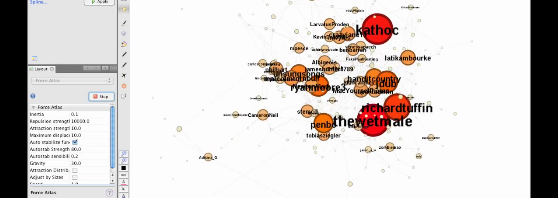
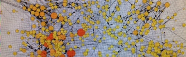
This is a quick demo of how the new timeline feature works in Gephi 0.7 beta. We’ve used 5 hours worth of @reply data from the Twapperkeeper archives for the #spill hashtag. This period corresponds to the ‘acute event’ in Australian politics that kicked off the election that sidetracked our research (in all kinds of productive ways, of course) – the day (the evening, and then the next morning) when now-PM Julia Gillard overthrew then-PM Kevin Rudd. Please don’t read too much (or indeed anything) into the actual analysis here, but for the sake of completeness: I’ve indicated betweenness centrality with both colour (red at the high end, yellow at the low end) and size.
The possibilities here are very interesting, particularly if we use better quality data that is properly set up for longitudinal analysis – e.g. so the nodes scale up and down properly through time. I’m pretty sure Axel has one of his epic and highly detailed methods posts up his sleeve in relation to all this, but for now, enjoy the pretty moving pictures – and apologies for the jerky cursor movements – I’m on the road and so without a mouse.
If you’re interested in any of the detail it is probably best viewed at the YouTube website in HD and fullscreen:
WARM in Urbino – presentation slides available
Just a quick update to say that the slides from the Workshop on Advanced Research Methods (WARM) at the University of Urbino last week are now available here .
It was a very interesting day, covering everything from Lady Gaga derivative videos to social media metrics and even personality identification using computational linguistics (!) – and it was a real privilege to be invited to share something of the state of play in internet research methods with my Italian colleagues.
I was there representing the Mapping Online Publics project – the slides from my presentation are embedded below. Many of the images come from recent progress we have made with analysis and methods – described in much more detail (mainly by Axel) across various posts here on the project blog.
Mapping Online Publics
View more presentations from Jean Burgess.
Popular Uses of YouTube in Italy and Australia: Part 1

I’m writing this from the University of Urbino, where I am spending a week as an academic visitor, leading up to a one-day mini-conference on research methods on Thursday, which I’ll blog about in a few days’ time.
Since I’m here, I thought it might be useful to do a quick comparative study of the popular uses of YouTube, looking at Italy and Australia, – Australia because obviously that’s the focus of our current project; and Italy because, well, I’m here and have access to local knowledge, and I think there could be some interesting similarities and differences. Also, Axel and I are gearing up for the ECREA pre-conference ‘Doing Global Media Studies’ in a few weeks’ time – while we’ll be discussing the blog and twitter mapping we’ve been doing, the issues of working within and across ‘national containers’ is currently at the front of my mind.
I am going to post these preliminary research notes on YouTube in Italy and Australia in two parts:
1. A look at the 20 most viewed videos of all time, comparing the Australian and Italian versions (that’s this post)
2. A look at the 20 most subscribed channels in the same locations (that’s the next post).
Continue reading “Popular Uses of YouTube in Italy and Australia: Part 1”
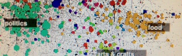
Mapping the Australian Blogosphere Some More

My previous post outlined a few more steps I’ve taken in cleaning up our emerging dataset of links in the Australian blogosphere (current limitations of our data are also listed there). It’s time to take those cleaner data for a spin, then. Beyond mapping the interlinkages between our known blogs during the period of 17 July to 27 August 2010 (roughly coinciding with the Australian federal election campaign), as I did a couple of posts ago, I’ll now work off the cleaned dataset which contains only those links which:
- originate from those sites in our list which we have confirmed to be (independent or professional) Australian blogs; and
- point to sites which are more than merely functional (i.e. sites which aren’t on tge destination filter list at the bottom of my previous post).
What I’m especially interested in as I work with these network data is:
- Which non-blog sites appear prominently in the network, and in what contexts; and
- which blog sites appear to serve as connectors between the various components of the overall network.
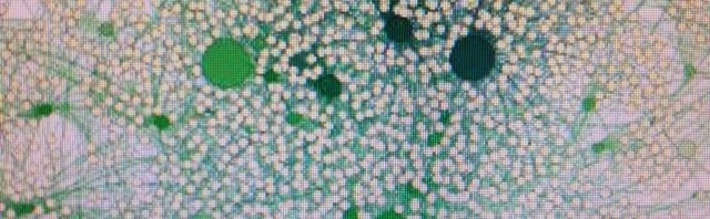
So, feeding the network data (close to 3.4 million links) into Gephi and filtering out any sites which don’t at least receive ten incoming links from anywhere in the network, here’s what we get (PDF here):
Continue reading “Mapping the Australian Blogosphere Some More”
More Blog Network Data Cleaning with Gawk

The other day I outlined some first steps in cleaning our blog network data (generated by our partner researchers at Sociomantic Labs) ahead of visualising it, and posted a first tentative visualisation of the part of the Australian blogosphere that we’re currently tracking. In this post I’ll continue that discussion, describing a few more steps in processing the data (again using Gawk).
Just to reiterate briefly the current limitations of our dataset:
- We’re tracking some 8,500 feeds at the moment, some of which are mainstream news sites or other sites with RSS feeds – so we’re only covering a part of the overall Australian blogosphere at this point.
- We’re still improving our approaches to extracting post texts and links from the blog pages – right now, our data still include text and links which are not in the posts themselves, but elsewhere on the page.
But even so, we can already begin to test our methods. Now, what we managed to get to in the previous post was to develop a Gawk script that truncated link destinations to their most meaningful component, in order to make network visualisation possible – if the link destination matched the base URL of one of the sites we’re following (e.g. domain.com.au/blog/), we used that URL instead of the full link URL (e.g. domain.com.au/blog/post-title.html); if the link destination was unknown, we truncated it to the domain only (e.g. domain.com.au). To improve the readability of the resulting network graph, we also dropped ‘http://’ and ‘www.’.
The first outcome from this process were the network maps I published in my last post, which further filtered the network to include only those sites which we’re actively tracking (including a number of mainstream media sites). But clearly that’s only one part of the picture – we’re just as interested in the extent to which the blogs we’re tracking are linking to other sites, from mainstream media in Australia and elsewhere through YouTube, Flickr, Facebook, and other social media sites, to any other sites which may be relevant to all Australian bloggers or any specific clusters in the blogosphere. To get there, we’ll have to massage the data a little further.
Continue reading “More Blog Network Data Cleaning with Gawk”
First Steps in Mapping the Australian Blogosphere
Following on from my previous post about the methods we’re starting to use to make sense of the Australian blogosphere data we’re receiving from our colleagues at Sociomantic Labs, here’s a first look at what happens when we begin to visualise those data in the open source network visualisation software Gephi. Let me begin by making one thing very clear, though: this is based on as yet incomplete data, and should not be seen to say anything comprehensive about the shape of the Australian blogosphere. What we’re currently working with is:
- a highly incomplete list of Australian blogs that is biased towards those genres of blogging that we already know quite a bit about, and
- hyperlink data that hasn’t yet been cleaned up to contain only those links present in the blog posts themselves, rather than links elsewhere on the page.
So, as we’ve explained in our previous work, we can expect plenty of false positives (e.g. sites like WordPress.org which appear to be central to the blog network, but are so only because many blogs run on and link to WordPress – not because their posts actually talk about WordPress-related topics), and a network structure which overrepresents those sectors of the overall Australian blogosphere where we already know and track a majority of existing blogs (e.g. Australian politics, which we’ve studied in detail over the past few years).
With those caveats in mind, though, in this post I’ll work through the data as they are at the moment, largely to test our methods as we’ve established them and to see what insights can emerge from this process. I’m drawing here on a slice of hyperlink data from the nearly 8,300 blogs that we follow (also including a number of mainstream news sites which have RSS feeds – these will be sorted into a separate category at a later stage), collected between 17 July and 27 August 2010 – i.e. roughly coinciding with the Australian federal election campaign between 17 and 21 August. (Given this heightened activity, we should expect an overrepresentation of political blogs, therefore, even beyond the skew towards politics in our overall list of blogs.)
Continue reading “First Steps in Mapping the Australian Blogosphere”