The images below present higher-resolution versions of the graphs contained in the chapter “A ‘Big Data’ Approach to Mapping the Australian Twittersphere” by Axel Bruns, Jean Burgess, and Tim Highfield in the collection Repurposing the Digital Humanities, edited by Paul Arthur and Katherine Bode, which will be published by Palgrave Macmillan in 2014. We are posting them here as a digital appendix to the chapter. For higher-resolution versions, please click on the images below.

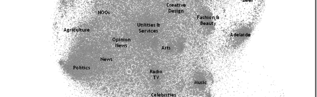
Figure 1: Thematic Clusters in the Australian Twittersphere. Based on network information for the 120,000 most connected users in the overall network.

Figure 2: Subdivisions within the politics cluster of the overall network map.


Figure. 3: Participation by Australian users in the hashtags #auspol (left) and #ausvotes (2010; right)


Figure 4: Participation by Australian users in the hashtags #masterchef (left) and #royalwedding (right)


Figure 5: Sharing of links to ABC News and news.com.au by Australian users