Television programmes spruiking their associated Twitter hashtags is now a common spectacle; we’re seeing this for everything from political debate (#qanda) to reality TV (#masterchef). One particularly successful example of this viewer engagement strategy was SBS’s recent Go Back to Where You Came From mini-series, which aimed to raise the tone of Australia’s depressingly low-brow political debate about asylum seekers by taking six contestants with strong views on ‘illegal’ migration on a reverse journey from Australia back to the countries of origin of many asylum seekers – in a reality TV-style three-part TV series.
The hashtag associated with the series was #GoBackSBS, and generated a substantial amount of participation over the three nights of the show (21-23 June 2011), as well as in the following week, when a panel discussion with the contestants was screened as well. Sadly, because I was stuck in Melbourne due to the volcanic ash cloud on 21 June and couldn’t start our hashtag capture in time, we weren’t able to capture the entire #GoBackSBS Twitter discussion about the show (for 21 June, we have data only from 22:04 onwards) – so it’s great to see that another group of Twitter researchers, Datalicious, have already published their analysis of some key content patterns in #GoBackSBS (some more precise detail on the dataset would be great, though, guys!).
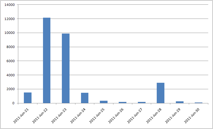
In addition to what they’ve already done, here are a couple of other ways to examine this dataset. First, here’s an overview of the total daily volume of tweets (as usual, including manual but not button retweets) using #GoBackSBS – with the obvious caveat that the figure for 21 June contains only those tweets made during the last couple of hours of that day – we would expect the total number of tweets that day to be comparable to, or even bigger than, that for the following days. Clearly a significant amount of tweets using the hashtag – and the vast majority of those tweets were made during and just after the actual programme screened on SBS, of course.

Much has already been made of the personal journeys of the various contestants (if that’s the right word in this case) on the show – some of whom experienced a complete reversal of their views on asylum seekers, while others didn’t. And if you missed the show – the SBS Website provides a quick overview of the contestants and their views prior to taking part.
Without wanting to add any personal judgments to what’s already been said about them, on Twitter and elsewhere, we thought it would be interesting just to look at which of the contestants attracted the most attention during the #GoBackSBS discussion (or at least the partial capture of it which we’re working from) – so my QUT colleague Stephen Harrington and I have come up with a graph of which Twitter users talk about which contestants. (You can read this map as something of a companion piece to the Datalicious map of what keywords are most closely associated with which contestants, too.) Here it is (PDF here):
What this map shows are the six contestants, in red, surrounded by the Twitter users who mentioned them by their first name, either once or multiple times. (We’re not including any more or less creative misspellings of their names here, by the way.) The size of the Twitter users’ nodes is set according to the total number of tweets they contributed to the #GoBackSBS discussion (i.e. tweets hashtagged #GoBackSBS – not just tweets mentioning the contestants): large nodes posted a lot of tweets to the hashtag conversation, small nodes posted just once or twice.
Additionally, we’ve coloured the Twitter users according to how often they mentioned one or another of the contestants: users showing up in a pale red colour tweeted about the contestants just once or twice; users in green mentioned them multiple times, with users in grey somewhere between the extremes. From this, some obvious patterns emerge: first, many more users mentioned Raquel and Adam than any of the other contestants – these two, clearly, were the ‘stars’ of the show, perhaps because their personal stories and their reactions to the experience were most worthy of criticism or praise.
Additionally, it also emerges very clearly that Raquel, in particular, attracted the largest number of ‘drive-by’ comments. Not only is there a large halo of one-time mentioners (in pale red) around her – that is, users who mentioned only her, not anyone else, and only once or twice throughout the entire period -, but many of those users are also shown here as very small nodes overall – meaning that they made just one comment about Raquel, and that one comment was their only contribution to the #GoBackSBS hashtag overall. (A similar pattern, but far less pronounced, also exists for Adam.)
Whatever it is that Raquel did, said, or represented during the series, in other words, it provoked plenty of people into commenting about her (or at least retweeting the comments of others) who didn’t have anything other to contribute to the #GoBackSBS discussion. Indeed, just to the southeast of the ‘Raquel’ node in the network, we also see a number of large green nodes which are closely associated with her – these would be major overall participants in #GoBackSBS who mainly tweeted about her, and rarely (if at all) mentioned any of the other contestants. By contrast, our other ‘major’ contestant, Adam, doesn’t have a comparable group of Twitter users obsessing predominantly about him.
Overall, of course, Go Back to Where You Came From largely is a story told through the personal experiences of its contestants – and the Twitter discussion of the show reflects this: there are a number of large nodes (i.e. users who tweeted a lot about the show in general) which are also shown in green (that is, they also mentioned the contestants’ names a lot), and very few large nodes in grey or pale red (which would indicate major contributors to #GoBackSBS who hardly ever mentioned the contestants by name, tweeting instead about the show as such). In addition to the group of major contributors who mainly obsessed about Raquel, then, we also see a smattering of large green nodes around the centre of the overall network – these represent major contributors who tweeted more or less equally about all the contestants, without clear favourites emerging. And further, there are a few groups of grey nodes scattered about the map like schools of fish – these largely represent users who mentioned any two of the contestants (e.g. Raquel and Gleny) and are therefore showing up somewhere between them.
Again, it’s worth stressing that this map builds on a somewhat incomplete dataset – it would be interesting to see whether it changes substantially if the full set of tweets for the first night of the series was included, and/or whether there are substantial differences to the picture for the individual nights of the broadcast, and the subsequent talk show. Perhaps we’ll have a closer look at those patterns in a follow-up post…
Nice dataset, but wheres the theory? its like any other so called network analysis: Huge,good looking, but pretty useless without a theoretical background. just descriptions, no insights.